team
Solo Project
Role
UX Researcher
duration
3 Months
Tools & Methods
Content Inventory, Sitemaps, IA Testing (Optimal Workshop)
Restructuring the web IA for an indie record store
Academic case study
Optimizing Reckless Records' web presence by restructuring information architecture and content strategy.

overview
The Goal
Consolidate and restructure the website's information architecture and content strategy to improve overall usability.
Background
Reckless Records is a music store with three locations in Chicago, known for its vinyl inventory and strong local following. The company currently has two active versions of its website, which focus on exploring available inventory.
Challenge
Presently, much of the site's content is restricted to searches and split across the two versions with inconsistent copy, leading to challenging navigation and poor discoverability.
*Accessed March 2024
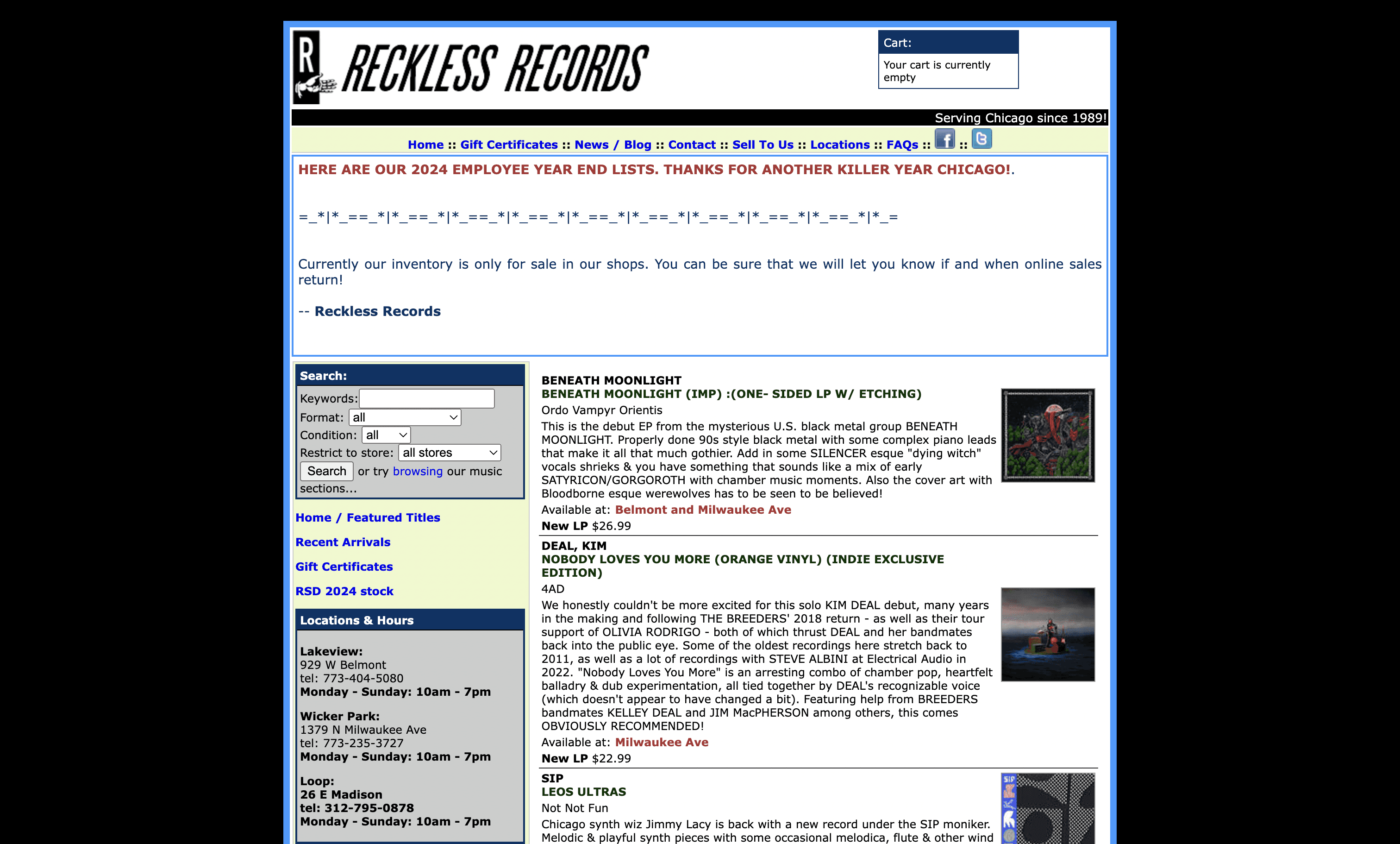
Reckless Records Version 1
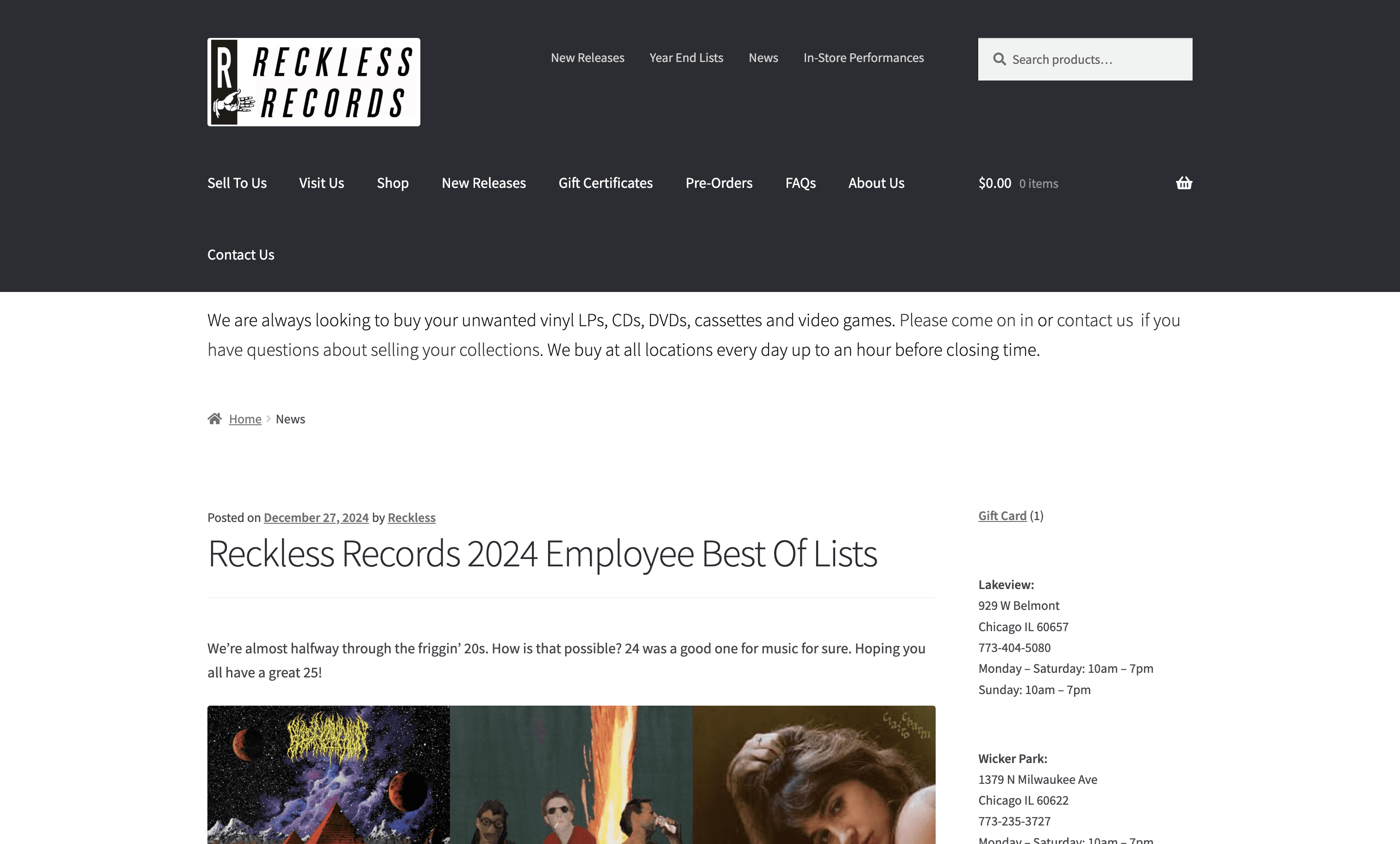
Reckless Records Version 2
Solution preview
A Clear, Unified Sitemap
A revised, user-tested sitemap validated through four rounds of testing and resulting in a 100% task success rate in the final round.
Research & Ideation
Rounding up all digital content
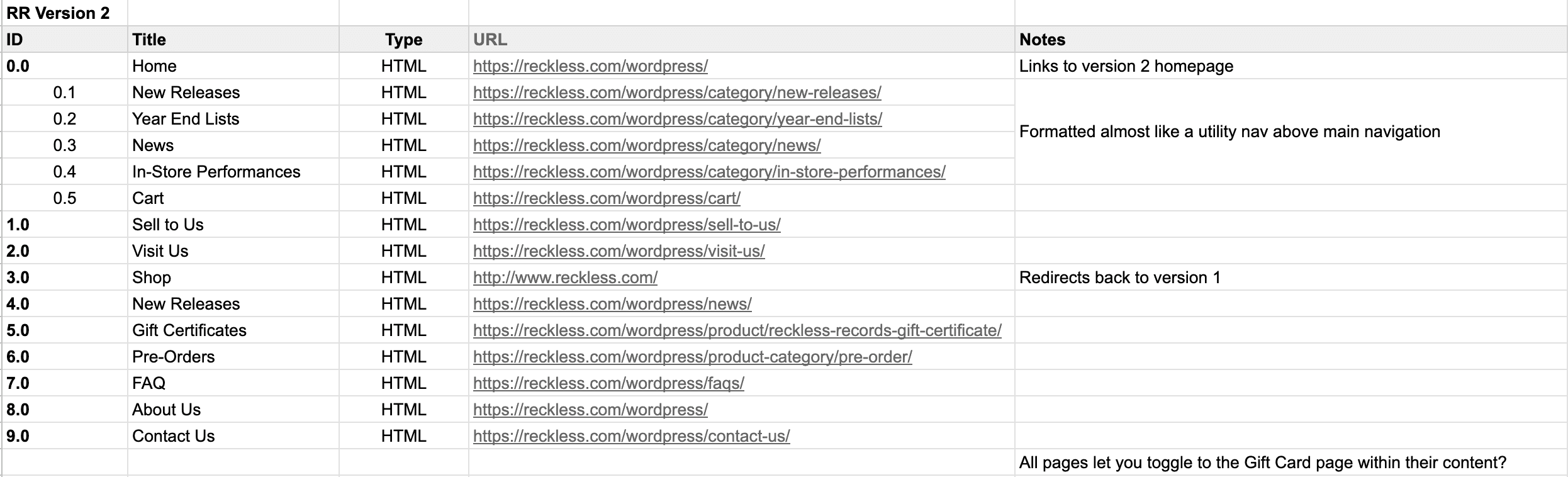
I started by conducting a content inventory to understand the website's existing structure, and uncovered three recurring challenges.
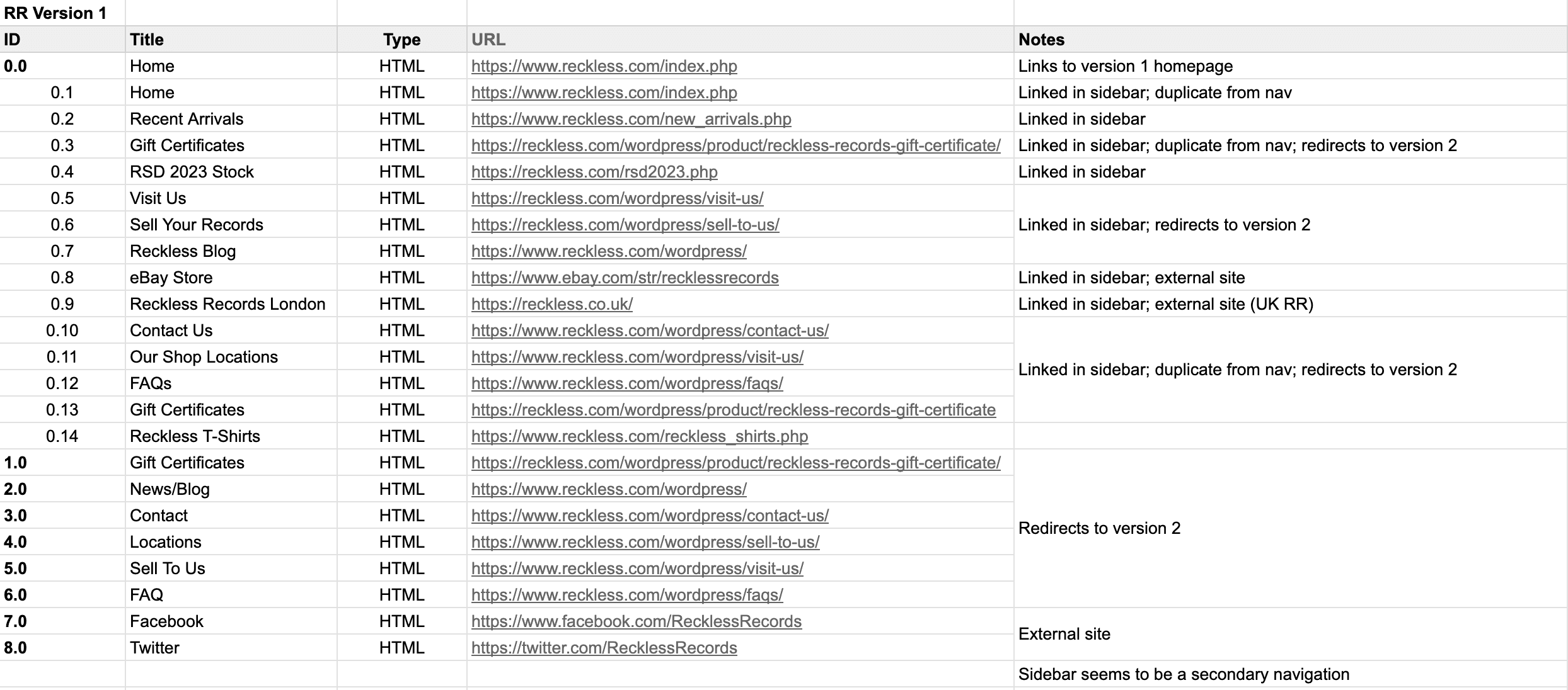
01
two active sites
Content is split across two different websites; some are exclusive to one version, while others are duplicated. However, the reason for this is not apparent.
For a store geared towards people who value music discovery, fragmentation and inconsistent content can make that experience elusive.
With this information, I decided to free-list all possible content items (existing and new) to ensure that every piece of content was accounted for. This was then used as the foundation for a new IA and four subsequent rounds of testing.
Testing & iterating
Understanding how content fits into users' mental models
01
Pilot study
30 cards
8 participants
02
First round
22 cards
24 participants
03
Second round
22 cards
10 participants
01
Pilot study
6 tasks
Peer feedback
02
First round
5 tasks
20 participants
03
Second round
5 tasks
11 participants
Designing
Finalizing content items for a restructured sitemap
Data synthesis confirmed that several nodes were better suited for searching or filtering, not navigating, and all first-level categories needed more specificity. Removing and renaming the appropriate items enabled further reduction of navigational clutter and increased content discoverability.

Wireframing two key user journeys within the new sitemap
After creating the new sitemap, I also identified key task flows for the website and created a mobile wireframe.
Annotation
1.X
Shop all displays all available vinyl records.
Each record card includes the album title and artist, a brief description, as well as its availability, condition, and price.
The filter icon allows the user to filter any vinyl record by genre, record size, or record label.
1.0 Vinyl Records
1.2 Shop All


Annotation
4.X
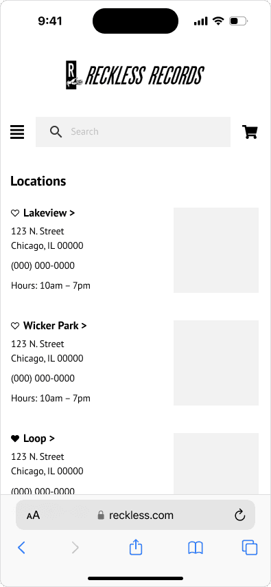
Users can favorite a store to save it as their preferred location, whether local to them or simply their favorite.
The store’s location information is also displayed here, including address, hours, and contact information.
Additionally, users can quickly access 1.5.X and 3.1/3.2 to view a selected store's inventory and relevant blog posts and news.
4.0 locations
4.1 Loop

Closing thoughts
What I learned
01
Content needs structure
Maintaining a content inventory is invaluable. Scattered links can get messy fast, confusing users and creating internal maintenance challenges in the process.
02
Dedicated navigation menus aren't the only access point
Not every link needs to be in the nav bar! Sorting, filtering, and other secondary options are equally helpful for users to find what they need.
What's next?
01
Additional testing + measuring success
Testing with a larger sample size – including more returning customers in particular – would fill in any gaps in data confidence and provide stronger validation for the IA.
Future testing should evaluate time on task, search vs. navigation, conversion rates, and error frequency.