Tl;Dr:
Project Overview
Background
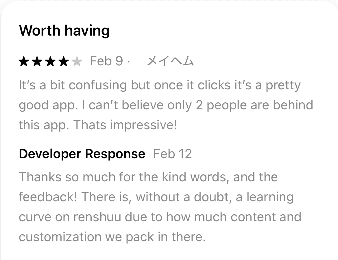
Renshuu is a Japanese-learning app with over 1,200 App Store reviews at a 4.9 average; it offers an extensive range of resources and tools that users deeply value and appreciate (myself included!), but this results in a few challenges, particularly for new users.
The Challenge
The amount of content often makes the UI feel cluttered and confusing, creating a steep learning curve. This, in turn, inhibits users' ability to easily access features, and eats into the time users spend actually learning the language.
The Goal
Declutter the navigation and UI to ensure users can immediately focus on learning the language, not navigating the application.
Solution Preview
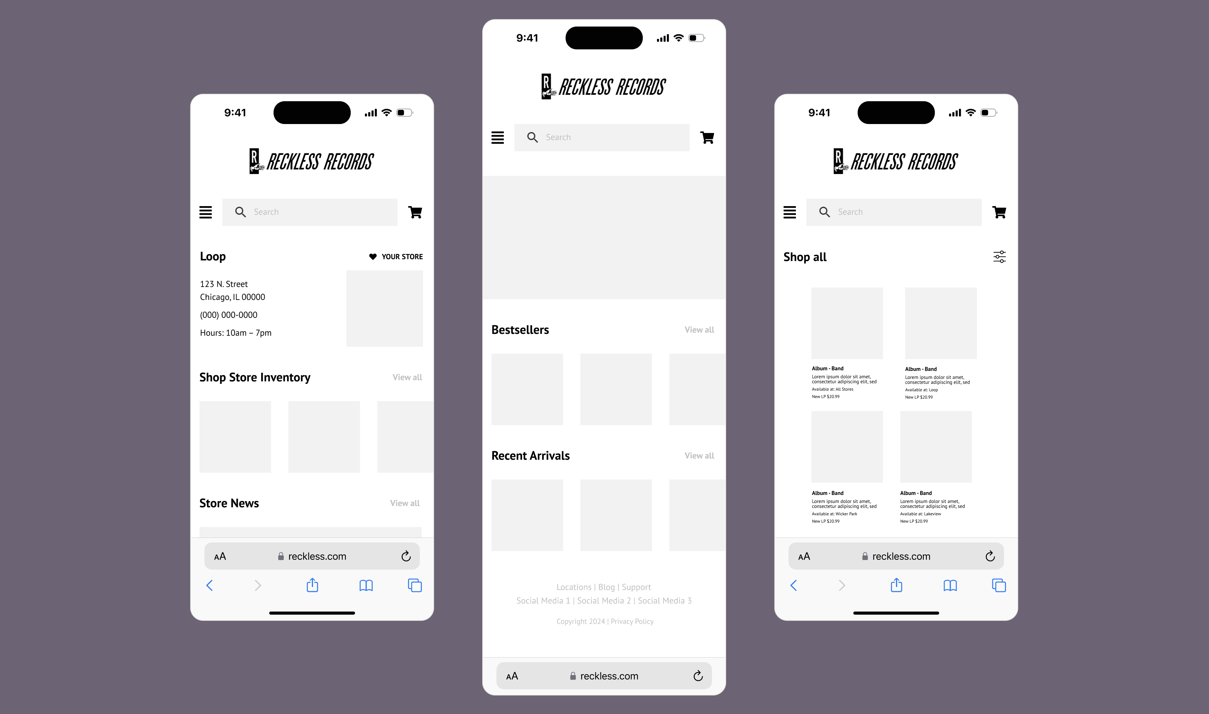
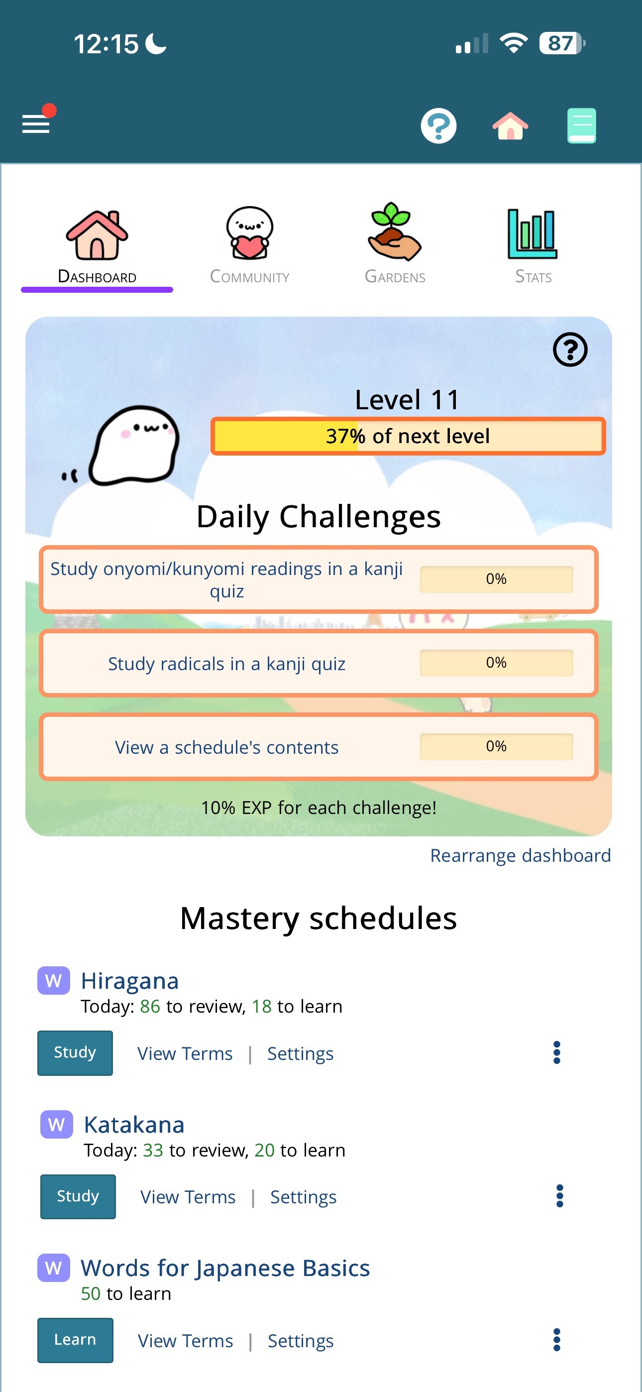
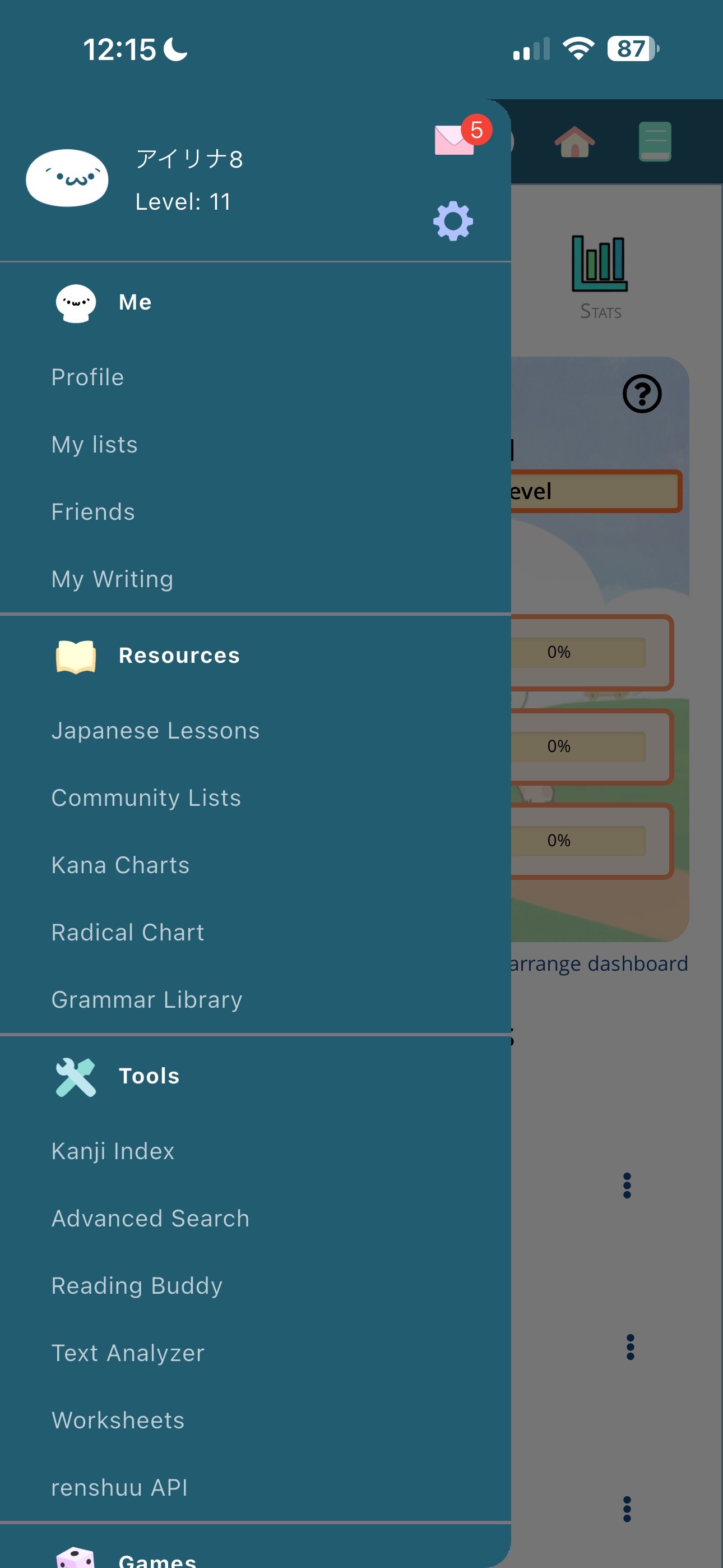
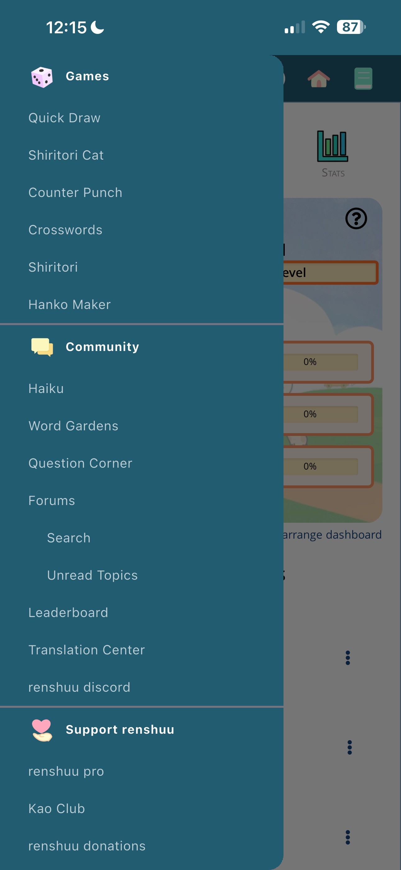
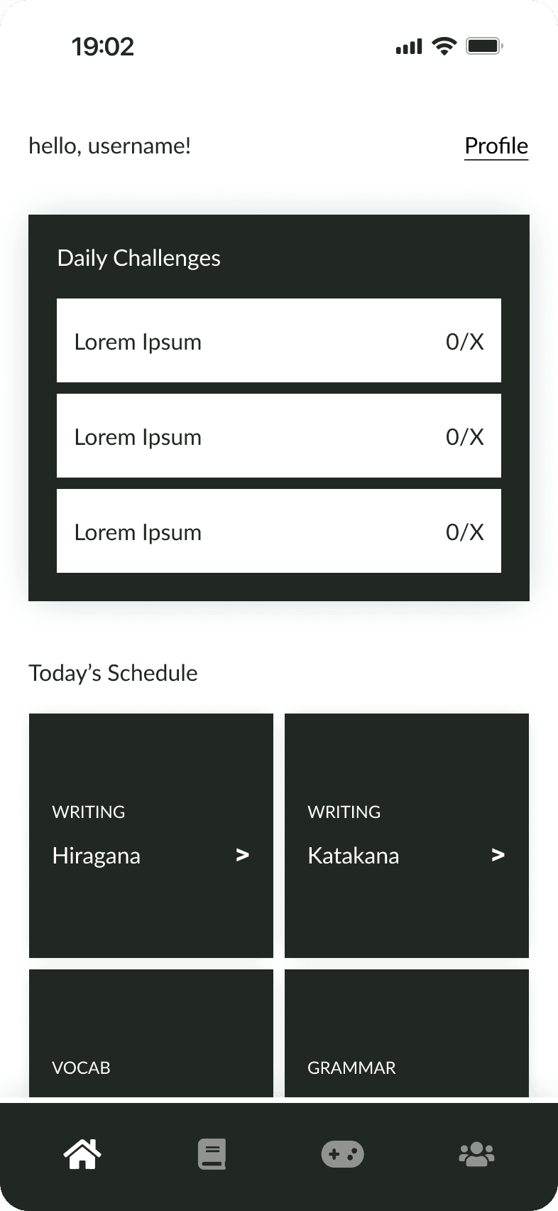
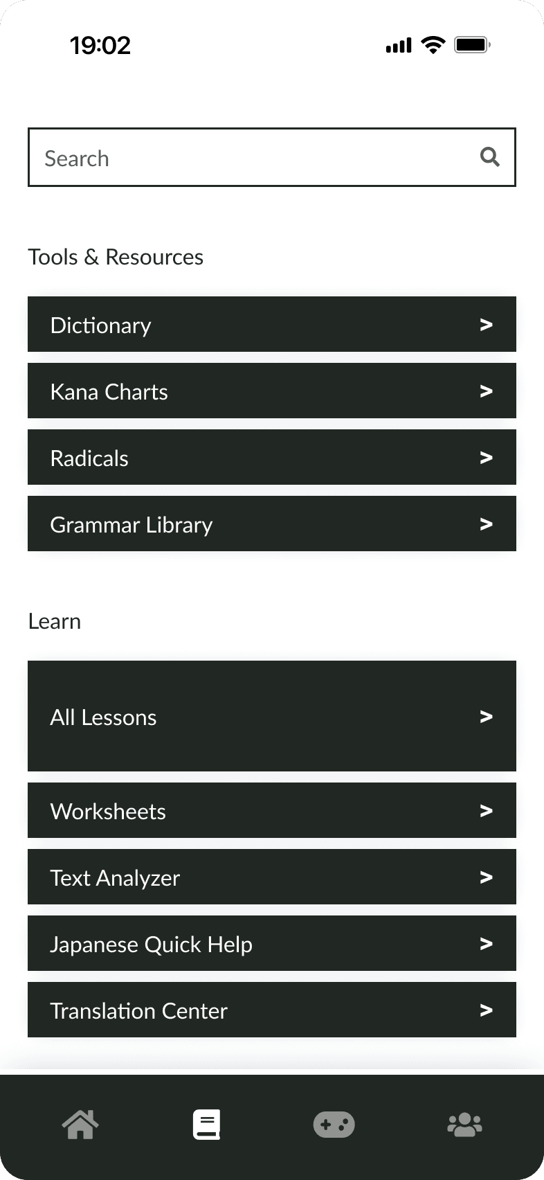
An Updated IA and Interface
A restructured IA and interface designed to focus users' cognitive effort on learning Japanese, informed by IA tests and user interviews.


Ideating
What are current users saying?
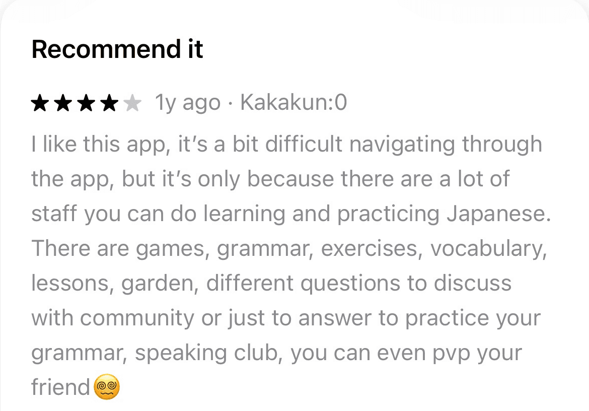
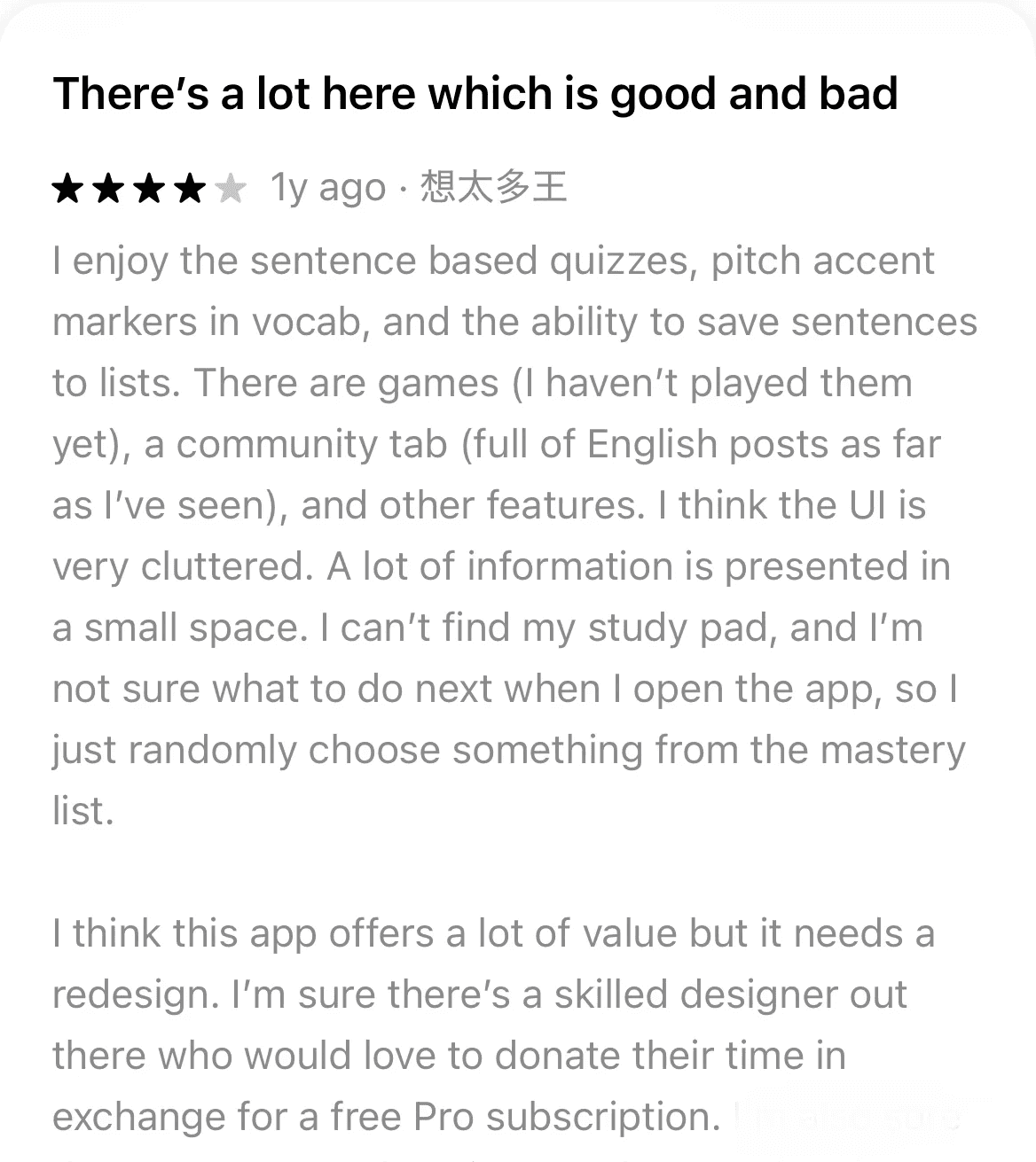
User feedback confirms the previously stated difficulties.
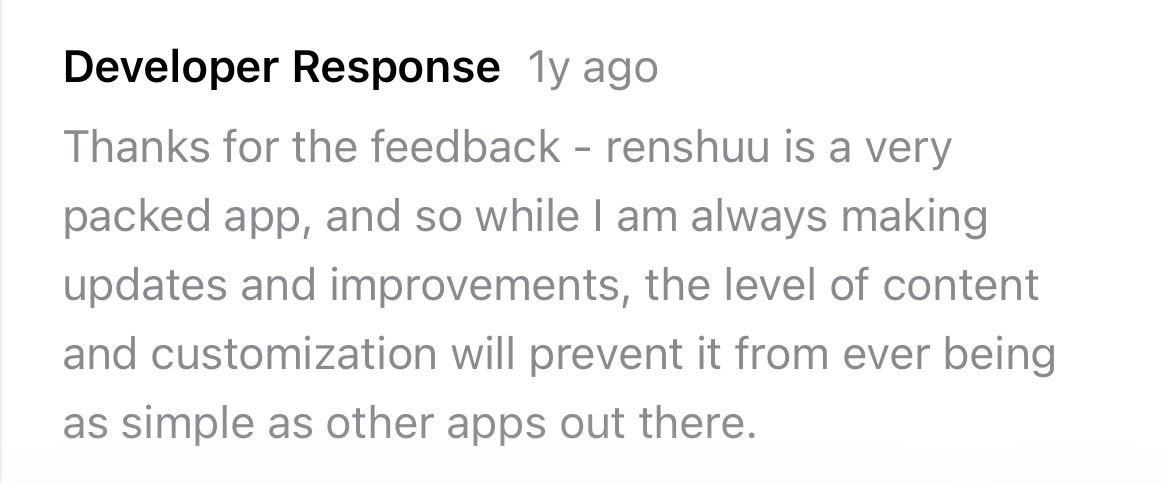
The developer also believes that the level of content and customization within the app limits the simplicity its UI can achieve. Perhaps this ends up being the case, but let’s dive a little deeper.
An interface that may ask for more cognitive effort in navigation than in studying can work against the goals of Japanese-language students.
Testing
Understanding users' mental models with a card sort
Given the primary issue was navigation and organization, I decided to start by creating a content inventory. I then conducted a hybrid card sort via ProvenByUsers, along with a follow-up survey. A total of four participants completed the study.
7 groups
The following categories were provided, based on the existing app: Me, Community, Resources, Support Us, Games, Tools, and Unsure. Users were able to rename categories, create their own categories, and add up to two subcategories.
Designing
Creating lo-fi wireframes
Given the strong placement agreement across the majority of cards, I chose to treat the primary navigation screens almost as full-page menus; this would provide every piece of content on the application a dedicated place to live, ideally reducing the learning curve.
testing
Validating the design direction with user interviews
I conducted a round of user interviews with three participants to evaluate the lo-fi wireframes and assess how they navigated the restructured content.
Designing
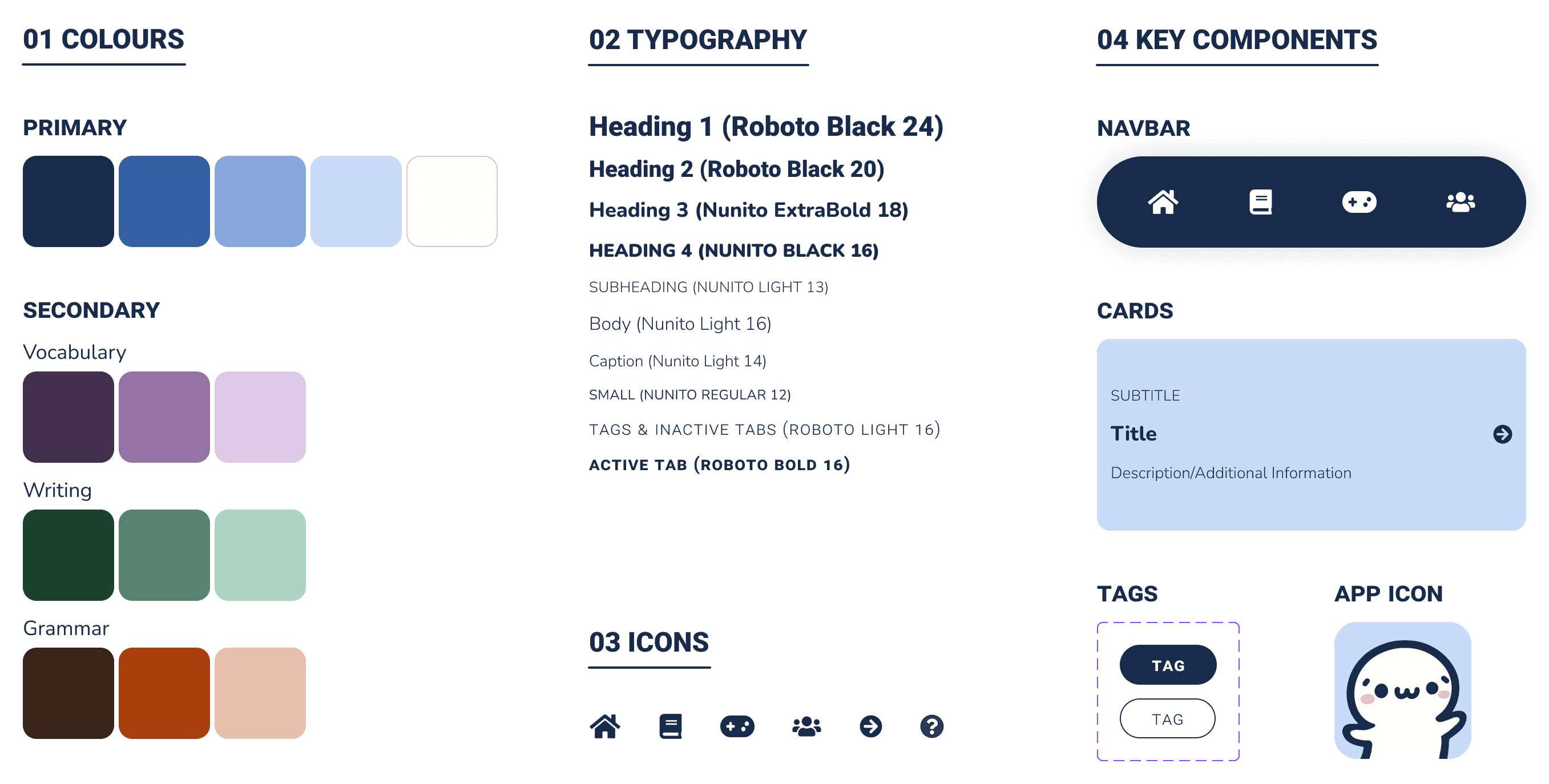
Creating a style guide based on lesson type
Before moving to high-fidelity, I created a style guide to ensure visual consistency throughout the application.
I leveraged color to distinguish between different content types, creating an additional navigational aid for users still familiarizing themselves with the structure.
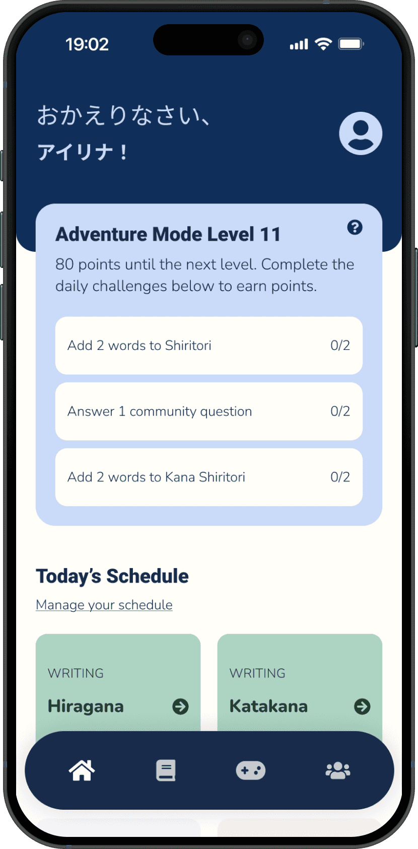
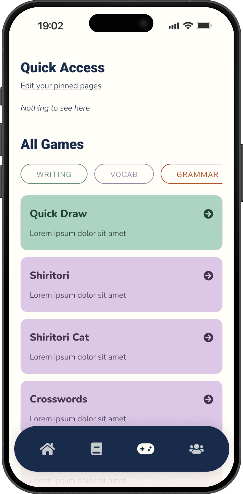
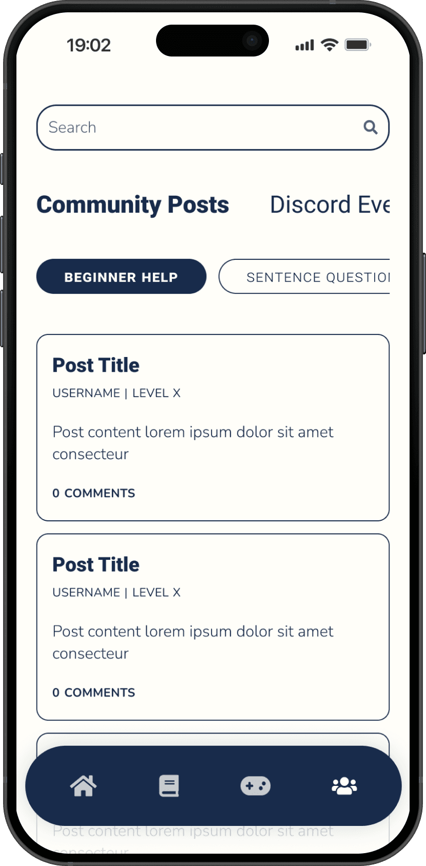
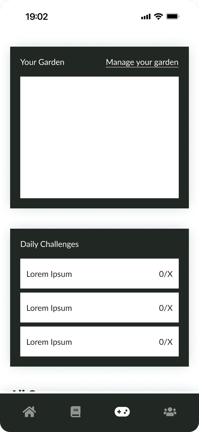
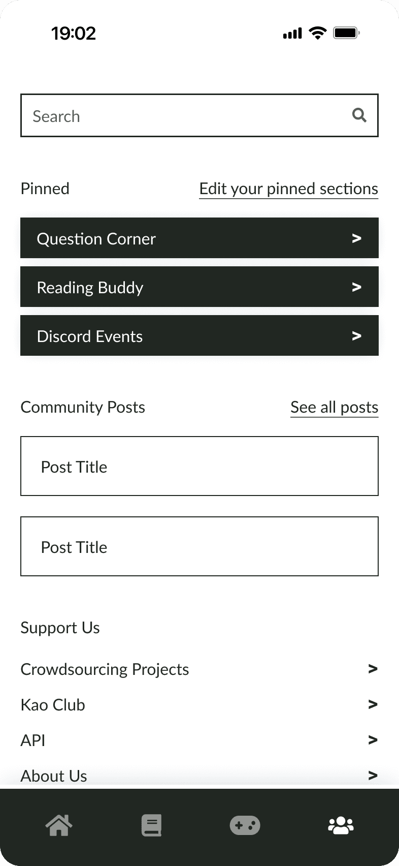
A new look, optimized for learning
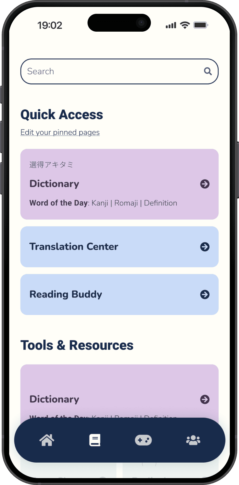
Based on the findings above, I centered improvements around terminology, content visibility, and clarity: I added explanations to certain links, restructured the games page, and replaced the pinned section on the community page with scrollable tabs.
Retrospective
Takeaways
Looking at the part in relation to the whole
Managing Renshuu's extensive content did prove to be relatively challenging, as the developer anticipated! However, it wasn’t an impossible task once each page was broken down and reviewed in relation to the overall hierarchy, which the card sort was invaluable for.
Next Steps
Designing for immersion
Since my primary focus so far was to ensure all content is transferred intuitively, I’d love to prioritize the UI/visual design in the next iteration.
The developer stated he wanted to create a Japanese-learning "world," so ensuring immersion and user engagement through the UI is a core goal of the product. Making the design more interesting and inviting, and reincorporating the mascot imagery would be some potential steps towards that goal.
Additional testing
A second card sort would help confirm the placement decisions I made for ambiguous cards. Additionally, a second usability test would validate the hi-fi changes and surface any remaining issues. The current sample size limits generalizability, so further testing is the clearest next step.
Measuring success
If these updates launched, I would love to evaluate a range of metrics, including but not limited to: time on task, task success rate and error frequency, search vs. navigation, conversion and customer retention rates, user confidence ratings, and SUS and NPS.