Overview
Buying merch at concerts can be a painstaking experience. You want the exclusive products, but do you go when you get there, so you get first pick and things don't sell out? Do you take a break in the middle of the show and miss part of the set? Or do you go at the end when you're exhausted and wait in a super long line?
None of those sound like great options, so I designed a concert merch app for a (fictional) rap group, K$, allowing fans to pre-order merch for pickup and view product availability in advance.
The Problem. Buying merchandise at a concert venue takes a lot of time and energy, with no equal alternative.
The Goal. Streamline the concert experience–maximise time spent at the show, and minimise time spent in long lines.
Understanding the User
I conducted interviews in order to better understand what the target group for this product most needs and how to best start designing for that. The primary user group identified through my research was young adults (18-24) who are avid concert-goers and want a simplified merch-buying process to support their favourite artists.
The surveyed user group confirmed initial assumptions about the types of customers this app would mainy service, but also revealed another user group that includes families with kids. For both groups, research revealed the current lack of digital pre-ordering options lengthens the purchasing process. These were the primary pain points:
- Time: Users want to get through the process as efficiently as possible.
- Accessibility: The products are targeted to those with existing familiarity; there is also no way to view all available items until the front of the line.
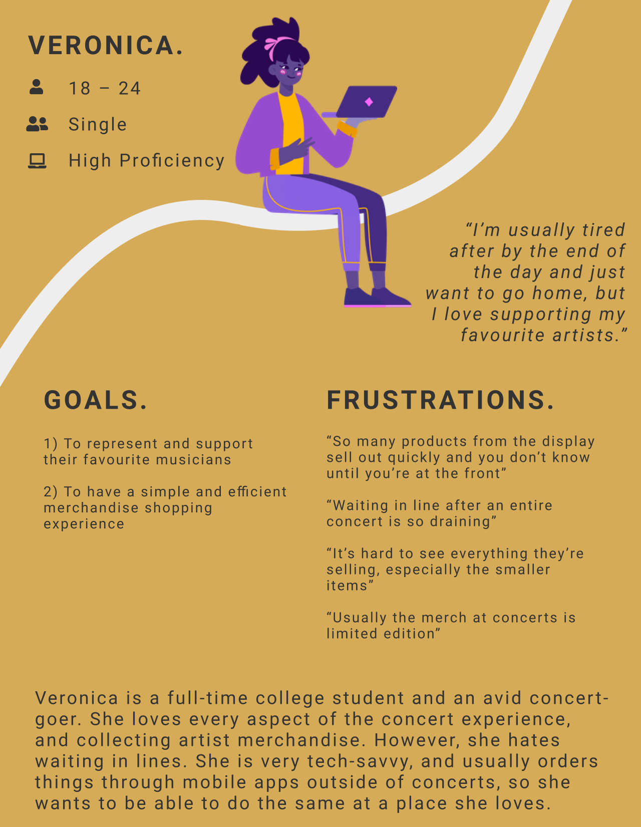
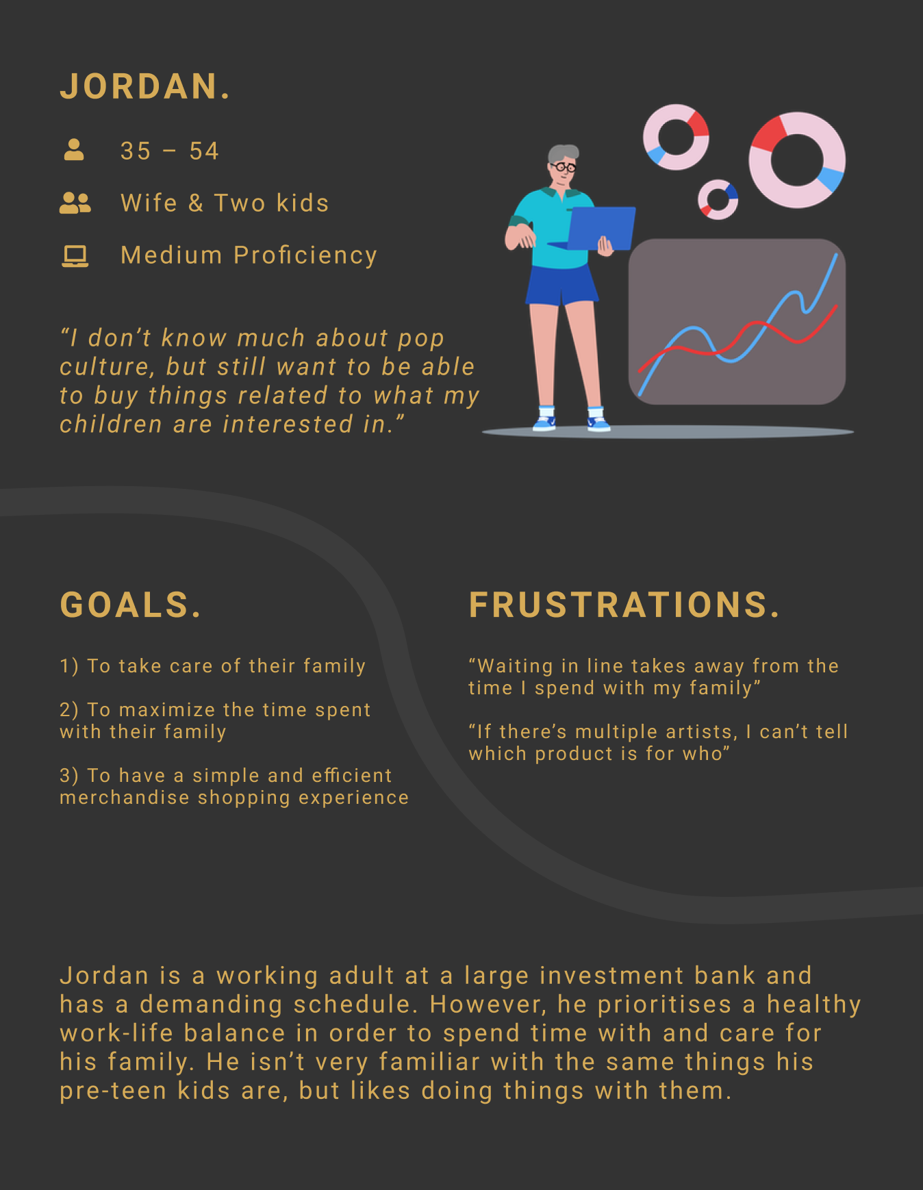
With these in mind, I created user personas and user journey maps to guide the process.
Competitive Audit
As a merchandising app, some key competitors who were necessary to analyse included eBay and Redbubble. None were direct competitors, but were still in the same market of selling musicians' merchandise.
The overarching trend was that these apps generally catered to an incredibly large user group, and as such, their products are often not divided into very specific and easily navigable categories.
Wireframing & Low-Fidelity Prototype
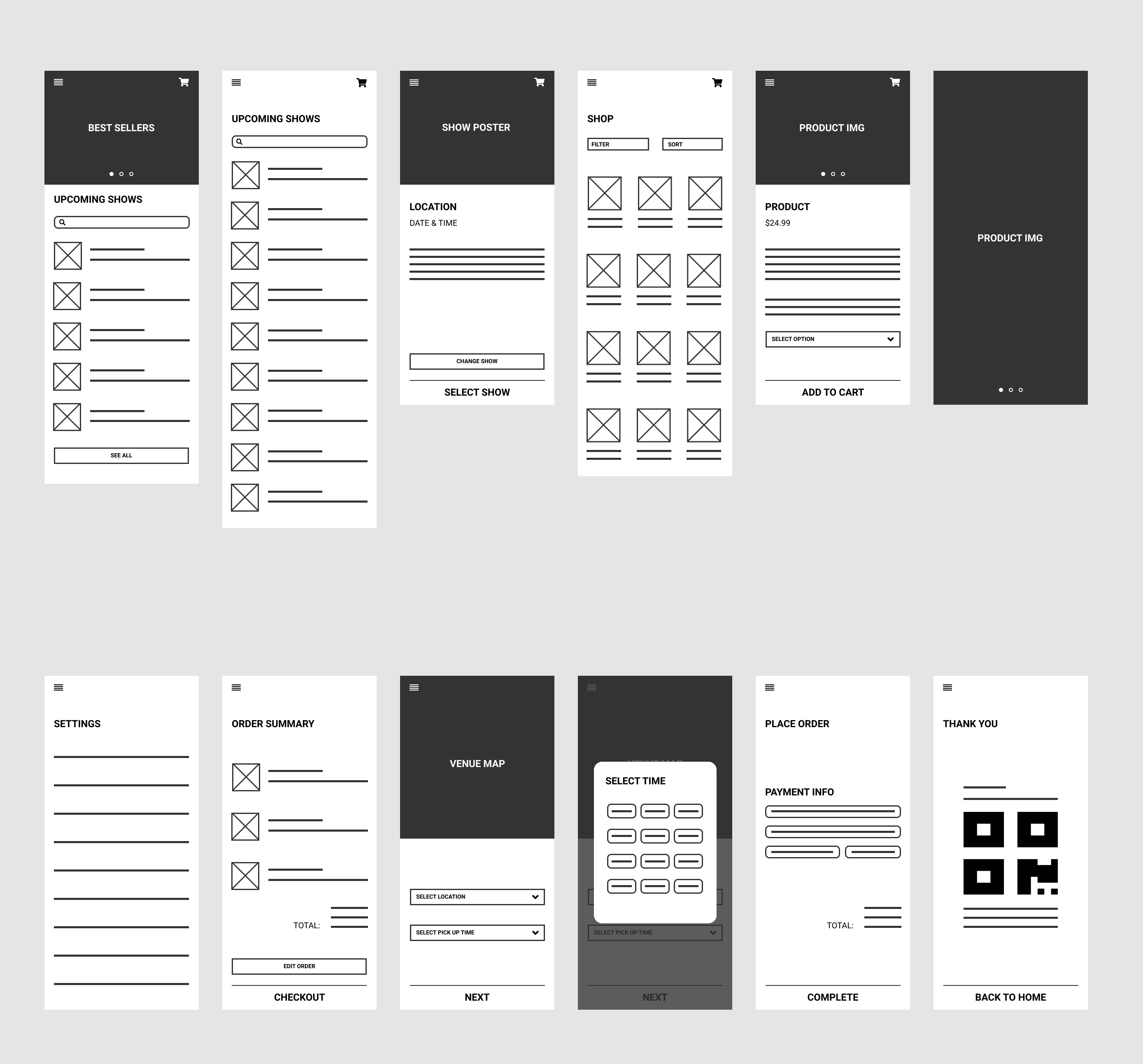
Paper wireframesDrafting iterations of each screen allowed me to ensure that the right elements were selected for the digital wireframes; ones that would best address pain points for users. I decided to keep the home screen simple to save users time spent on navigation.
Digital WireframesAs the design phase continued, I made sure to base all design decisions on feedback and findings from user research. A simple and straightforward process was a key user need to address in the designs; each page of the app prioritises the upcoming shows and available products.
Low-Fidelity PrototypeThe low-fidelity prototype connected the primary user flow of pre-ordering merchandise, so the prototype could be used in a future usability study.
Usability Study
Following lo-fi prototyping, I created a research plan to conduct a usability study. This included a set of 12 questions and tasks for participants to complete. A quick affinity diagram revealed these findings:
- Users want a more intuitive checkout process.
- Users want to the selected show to be easily visible throughout the flow.
- Users want to buy merch quickly.
Style Guide
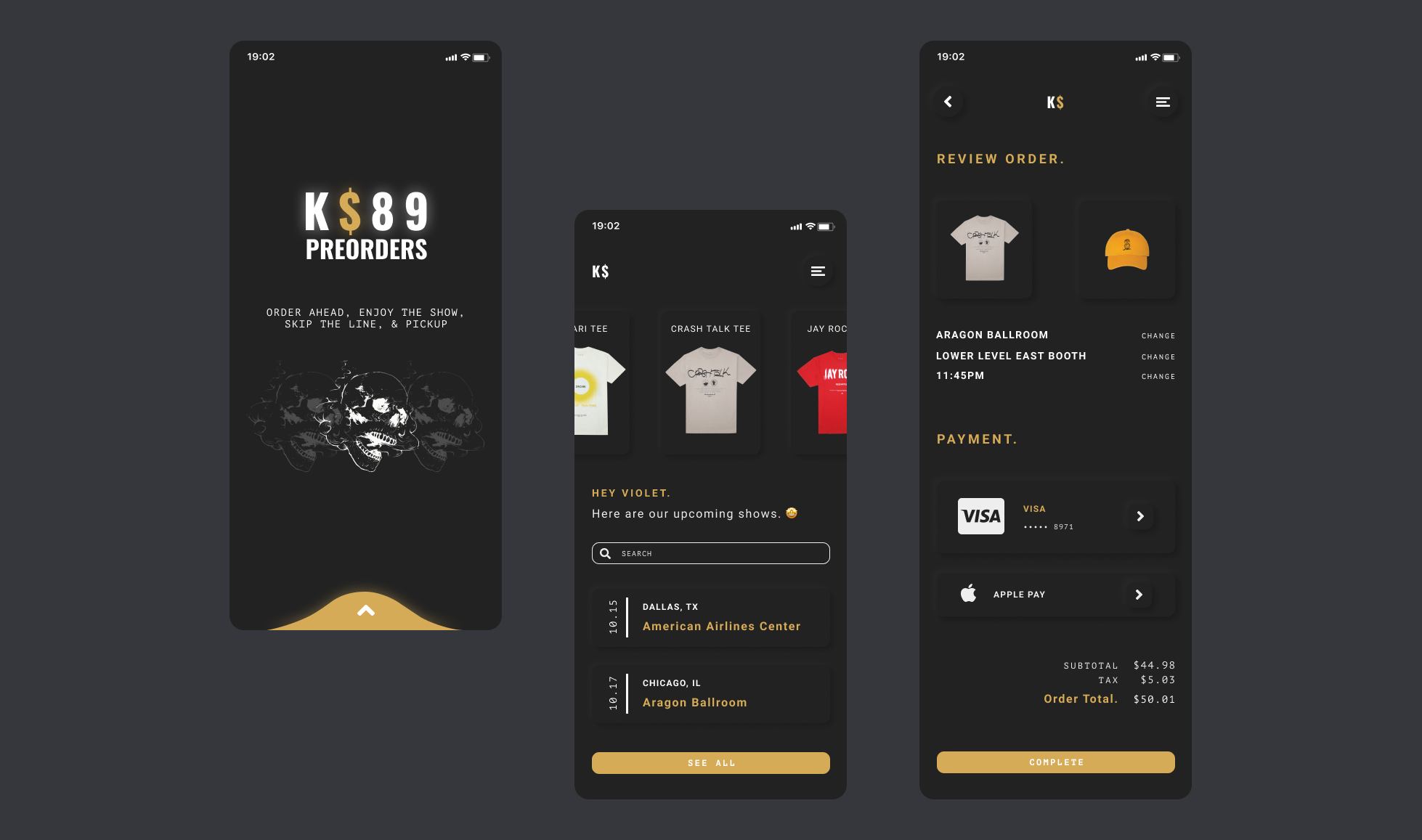
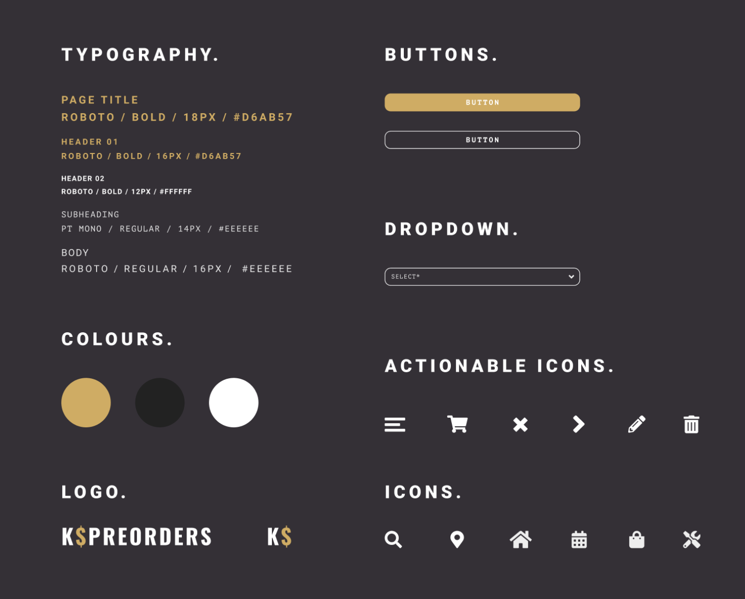
K$'s dark and muted colour scheme comes with the image of being at a concert in mind–you could sneak the app open in the dark and no one would know! The yellow accent colour is intended to make the app feel a little warmer and more inviting.
Mockups & High-Fidelity Prototype
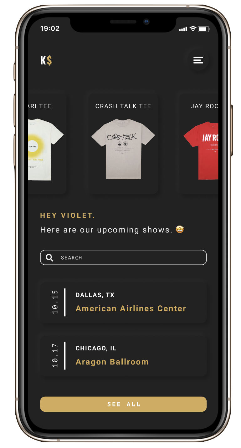
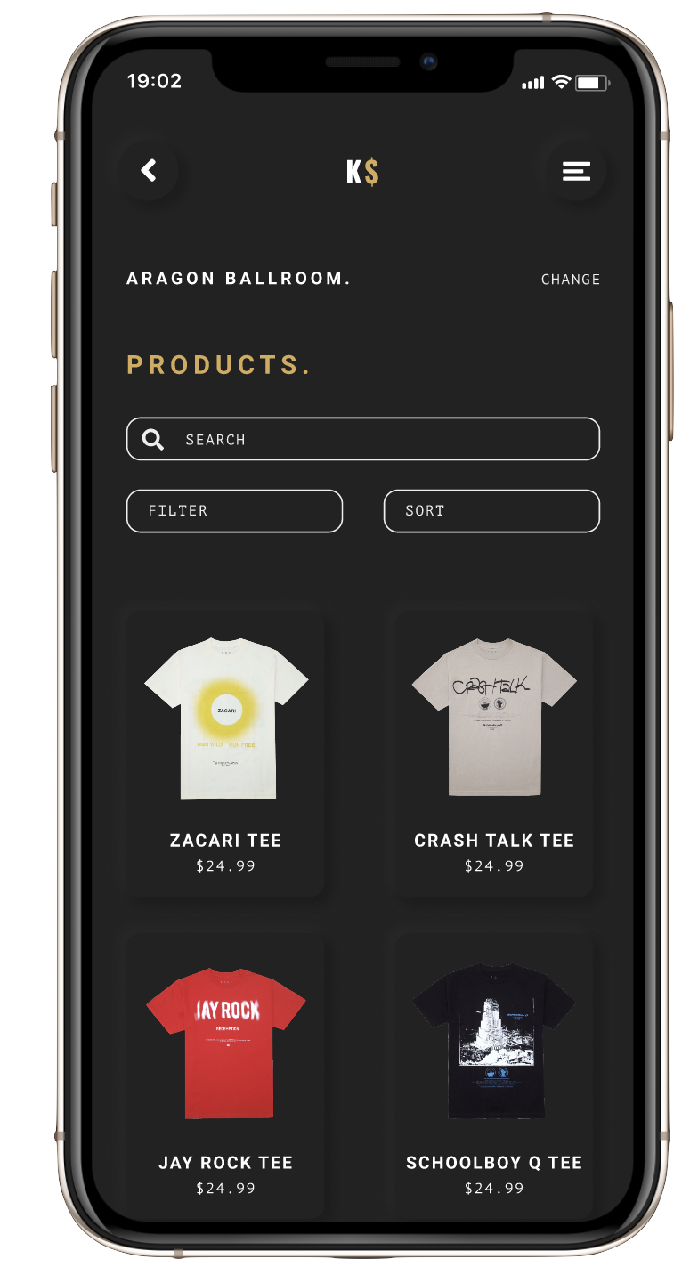
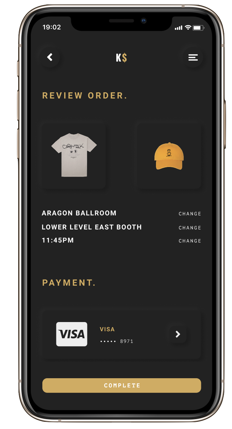
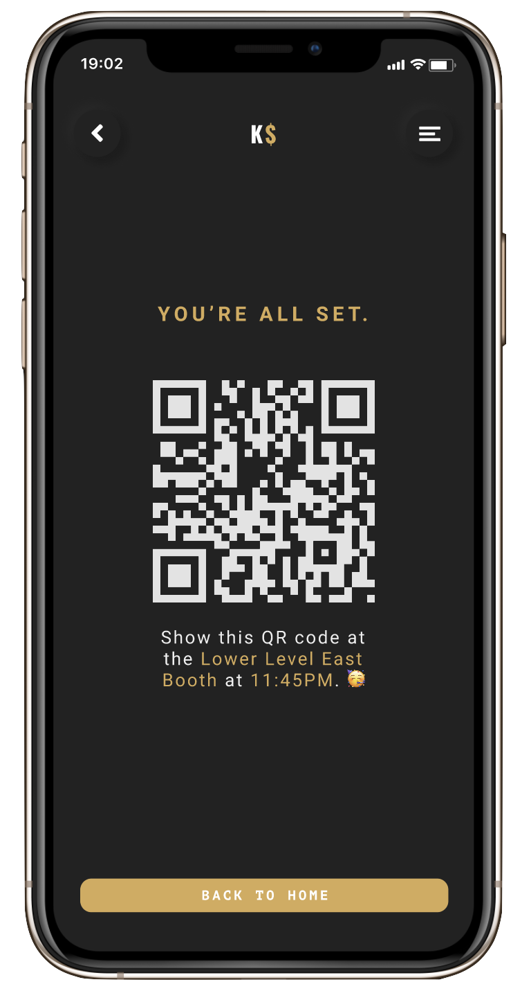
After some more work, I conducted a second usability test and made edits to the design as necessary. Here is the final product!
Takeaways & Next Steps
As someone who loves going to concert and collecting tour merch, this was an exciting project to work on. This was my first time going through the full process from ideation, to testing & research, to designing, and it was definitey an incredibly useful skillset to gain. The emphasis on user reasearch also helped me learn to really focus on keeping the user at the forefront of my work (as is the point of UX design, but with personal projects, it's easy to get lost in your own ideas), and it's something I know will help me in future work.
As for next steps, conducting more usability testing would be helpful to ensure all pain points have been addressed and there are no new user needs. I also think this could be a great app to expand to venues or lables instead of specific artists, which could be something to work on in the future.
