Tl;Dr:
Project Overview
Background
My team developed this project to supplement a physical experience with a digital aid. While scoping the project, we discovered a mutual frustration with online exercise class registration.
The Challenge
Online class registration processes are often time-consuming, and complicated or unclear about pricing, payments, and class information.
The Goal
Help users feel empowered and in control of their personal fitness experience through a transparent and trustworthy class booking process.
Solution Preview
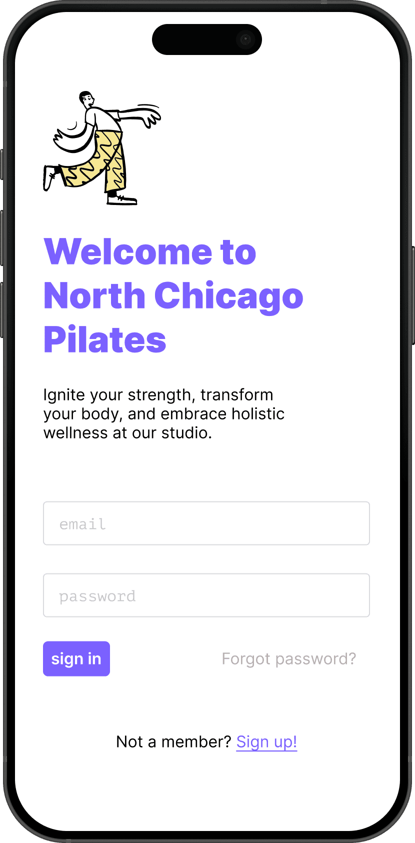
Meet North Chicago Pilates
A class booking experience designed to center transparency and trust, informed by a contextual inquiry and usability tests with 100% task completion.
Ideating
Understanding users' pain points
We conducted a total of eight contextual inquiries and found a few commonly cited issues, which informed our persona development.
luca, 32
studio regular
Goal: Challenge himself with a more advanced class while fitting fitness into a busy schedule.
Frustration: No free trial for advanced classes made it hard to commit, and having to be manually checked in at the front desk wasted time.
Quote: "I have to be manually checked into my studio, which takes a lot of time." – P2
A registration process that obscures pricing, complicates booking, and requires manual check-in can undermine students' confidence in a studio.
Mapping what users need the product to do
The inquiries also informed our concept analysis table. This helped prioritize and finalize product direction, and informed the content and interactivity for the solution.
Testing
Validating the structure with usability testing
Synthesizing the generative research allowed us to develop our first lo-fi wireframes. To validate our design, we conducted a round of usability tests.
2 user flows
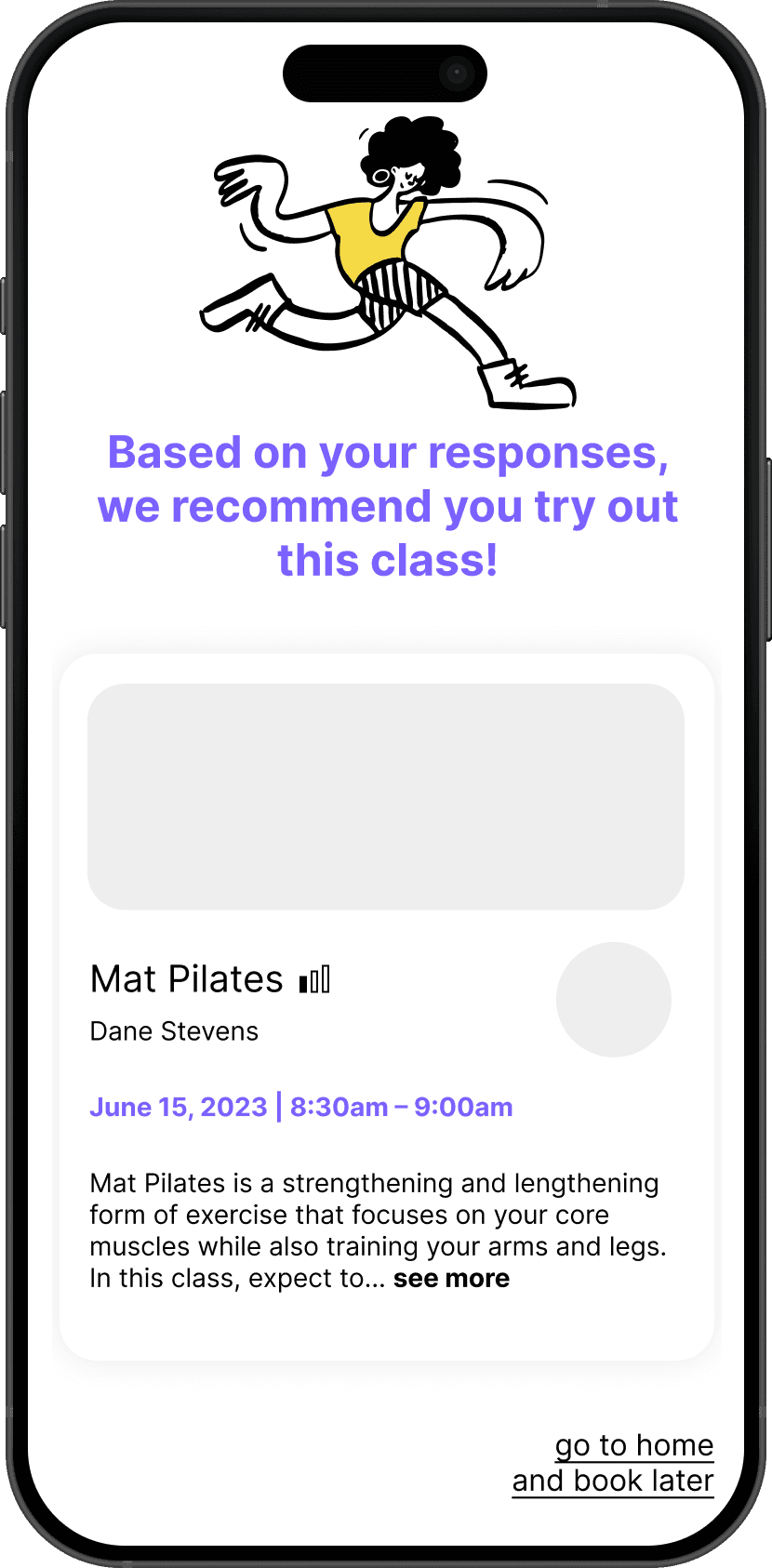
New users creating accounts, adding preferences, and reviewing recommendations; and returning users booking classes using credits through the favorites page.
Designing
Wireframing user flows
New users
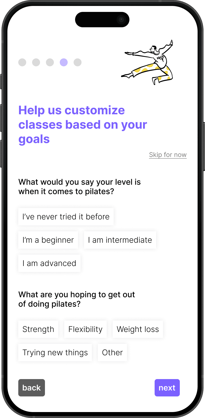
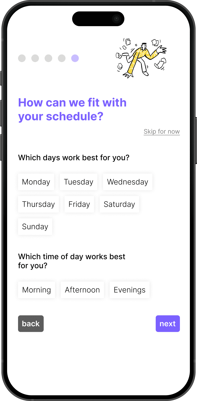
After registering, new users can set class preferences, sign waivers, and register for their first class, all without unnecessary time or effort.
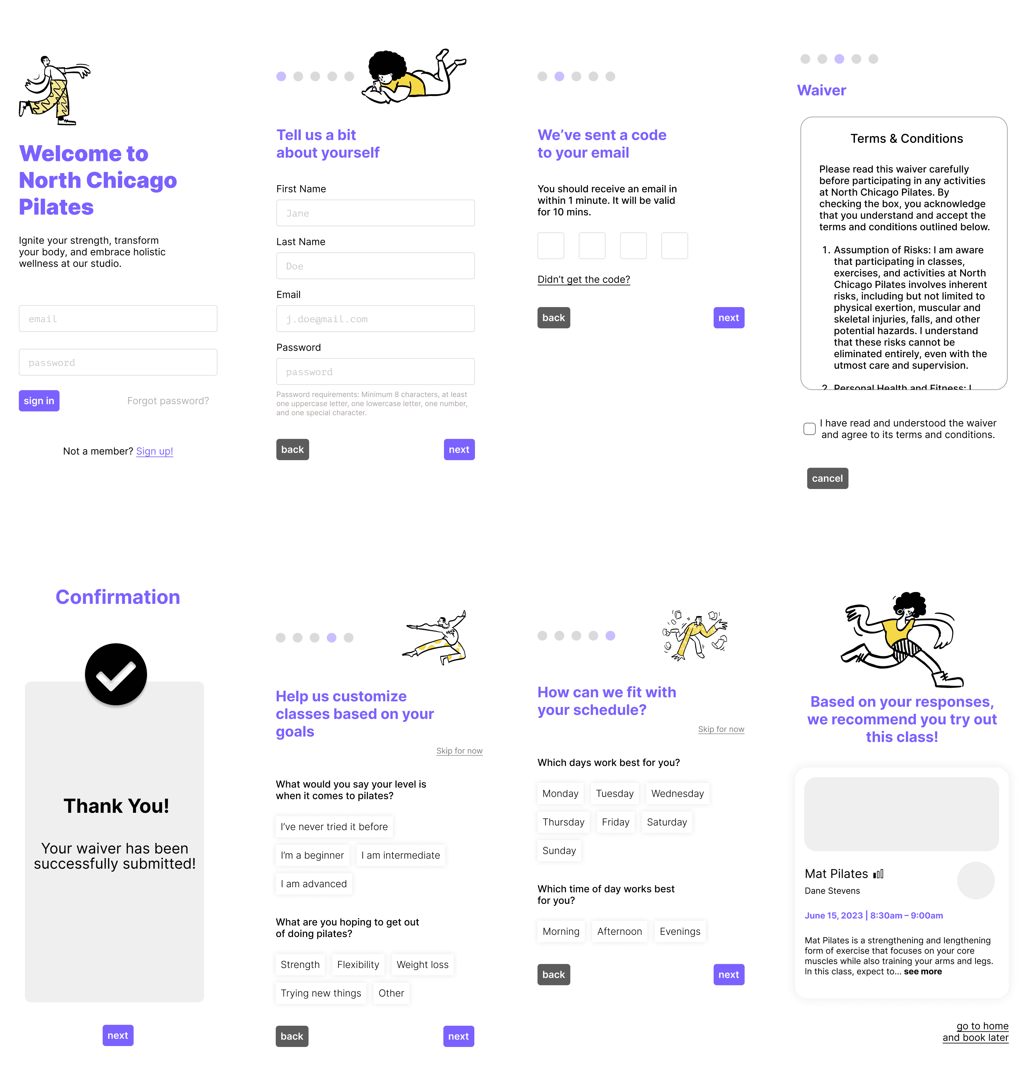
Returning users
Returning users can browse saved instructors and check in digitally, with pricing and class details clearly highlighted throughout.

Retrospective
Takeaways
We are not the user!
I know, it's a cliché – but important nonetheless! Going into this project, we initially planned a feature allowing communication with instructors outside of classes, but most users showed little interest. This feedback helped us focus on core features that users did demonstrate an interest in.
Choosing the right tools
While we had a shared understanding of data organization, we failed to consider using more effective data collection tools, like Airtable, to streamline our analysis and collaboration, creating extra work during meetings.
Next Steps
Full product scope
Ideally, we would expand to a high-fidelity prototype that supports the full scope of interaction beyond these two specific user flows.
Measuring success
If we launched this project, we would love to evaluate user confidence ratings, conversion rates, time on task, and error frequency, among others.

