team
Solo Project
Role
Product Designer
duration
3 Months
Tools & Methods
Figma, Competitive Analysis, User Interviews, Usability Testing
end-to-end product design for a social media-tracking app
Chronicle is a multi-format media-tracking application with community features, streamlined into a singular tracking experience to minimize friction.

overview
The Goal
Design a media-tracking experience that consolidates formats and community features, without sacrificing effectiveness in either.
Background
Media-tracking apps aim to provide organization for an ever-expanding media landscape, but they often introduce more friction than they remove.
Challenge
A competitive audit of eight apps revealed a consistent pattern: a single-format focus, unequally robust features, and isolated discussion opportunities.
Solution preview
A social cataloging platform for books, movies, and TV
Designed to help users grow their community, stay organized, and discover new media, optimized for comprehensiveness and customization.


Click a screen to enlarge

Research & Ideation
Understanding existing media-tracking applications
To better understand the gap in the market, I conducted a competitive audit of eight media-tracking applications; current solutions:
For users who track multi-format media and want deep community-based features, there is currently no single app that does both well.
Chronicle's key interactions
The gaps from the competitive audit informed four core interaction areas to prioritize in the wireframes:
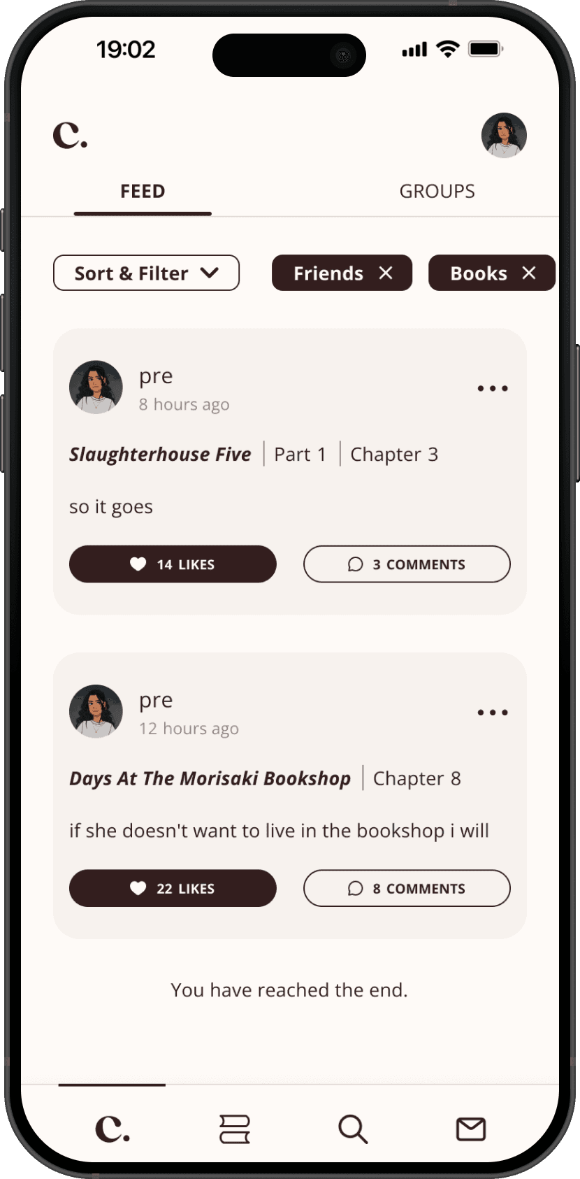
Community
Users can participate in public conversations by viewing and making posts, even outside of specific media pages. These posts can be filtered by media type and/or posts by friends. Post details include attributions, avatars, likes, and comment threads.
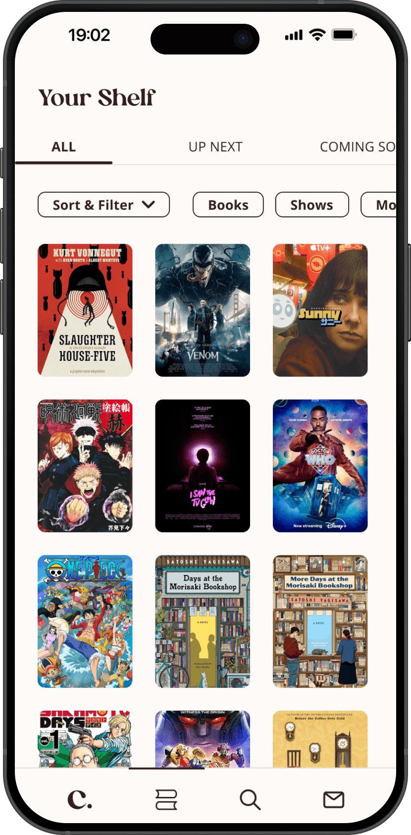
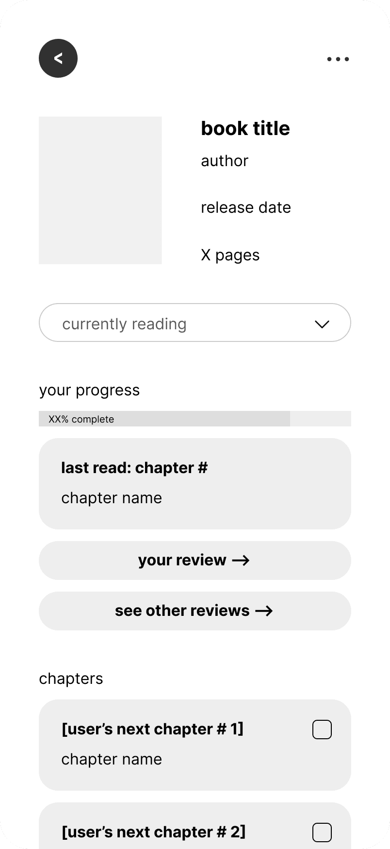
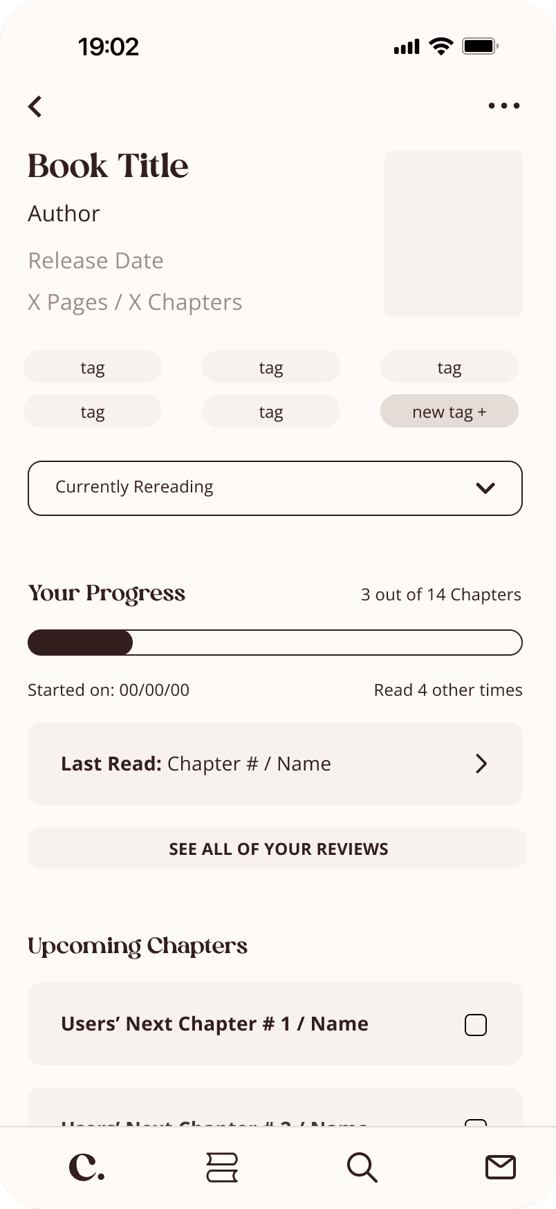
Media
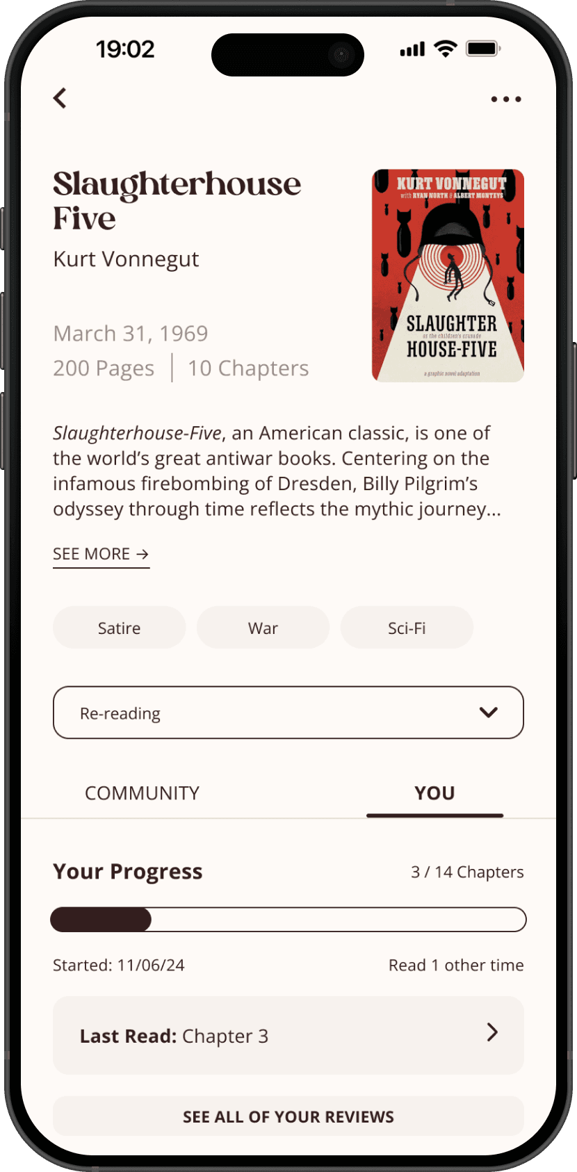
Users can collect and save media. Media detail pages highlight users’ upcoming chapters/episodes and community reviews.
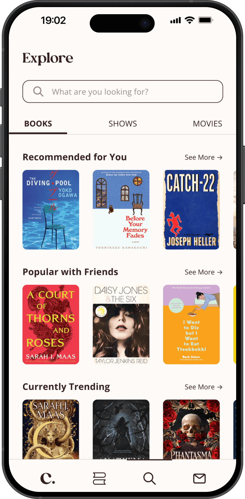
Discovery
Users can search for content and receive recommendations for each type of media. Recommendations are based on previously logged/collected content, as well as trending and popular media. The search bar can also be used to find other users and groups.
Tracking
Users can add tags and reviews, as well as emotions, additional comments, and images when logging content.
Testing & iterating
Refining the lo-fi with users
With the market gaps and key interactions to guide the design, I built lo-fi wireframes. I conducted three user interviews focused on participants' media habits and community behaviors before iterating.
Solution
01
Consolidated buttons
Clicking any chapter opened all threads, discussions, and reviews directly, keeping everything in one place.
02
Added contextual information
Added an easily accessible list of user reviews and user-added tags to give users the full picture on one screen.
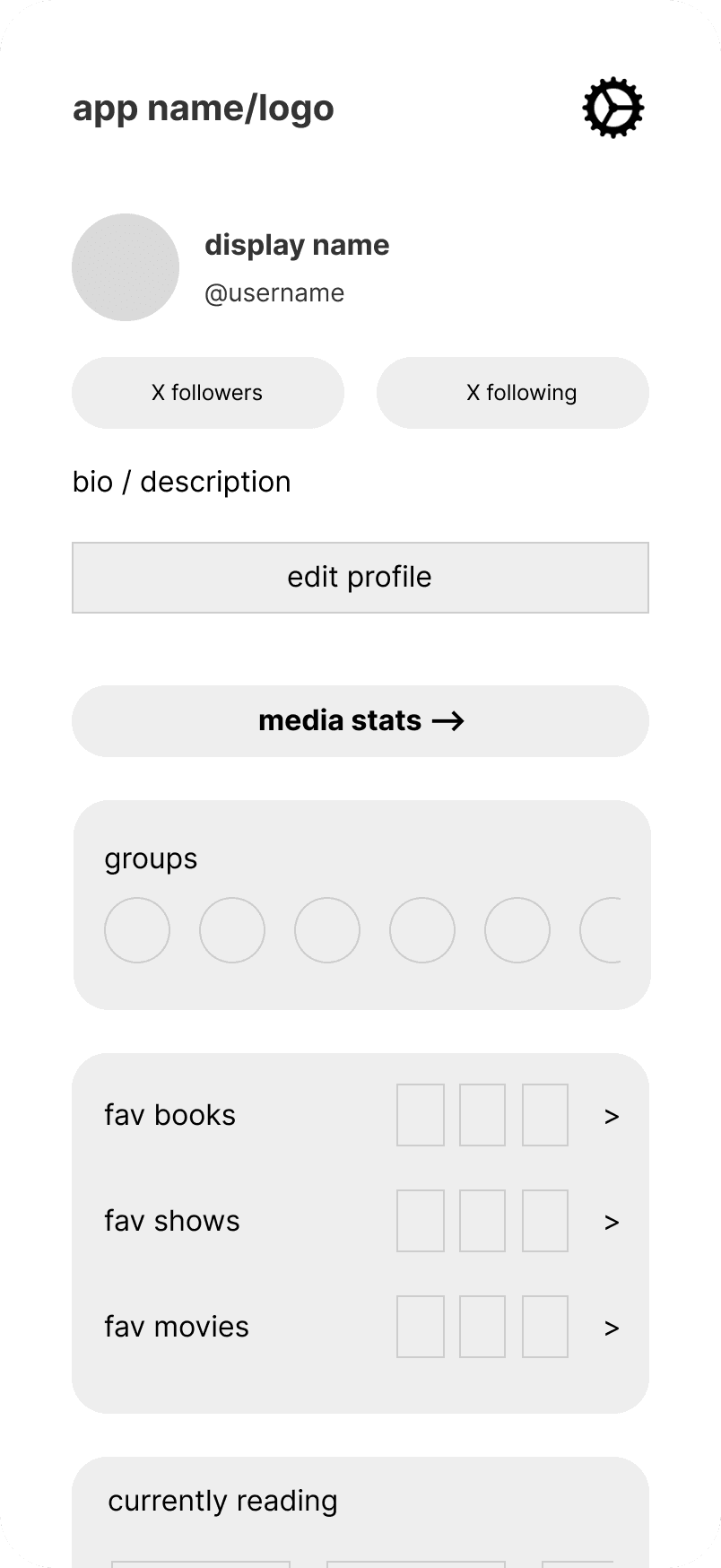
Lo-Fi
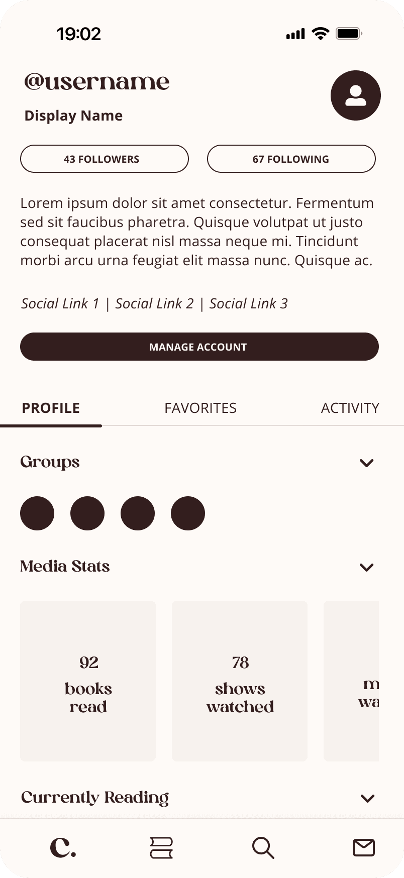
Mid-Fi
Solution
01
Created a buildable foundation
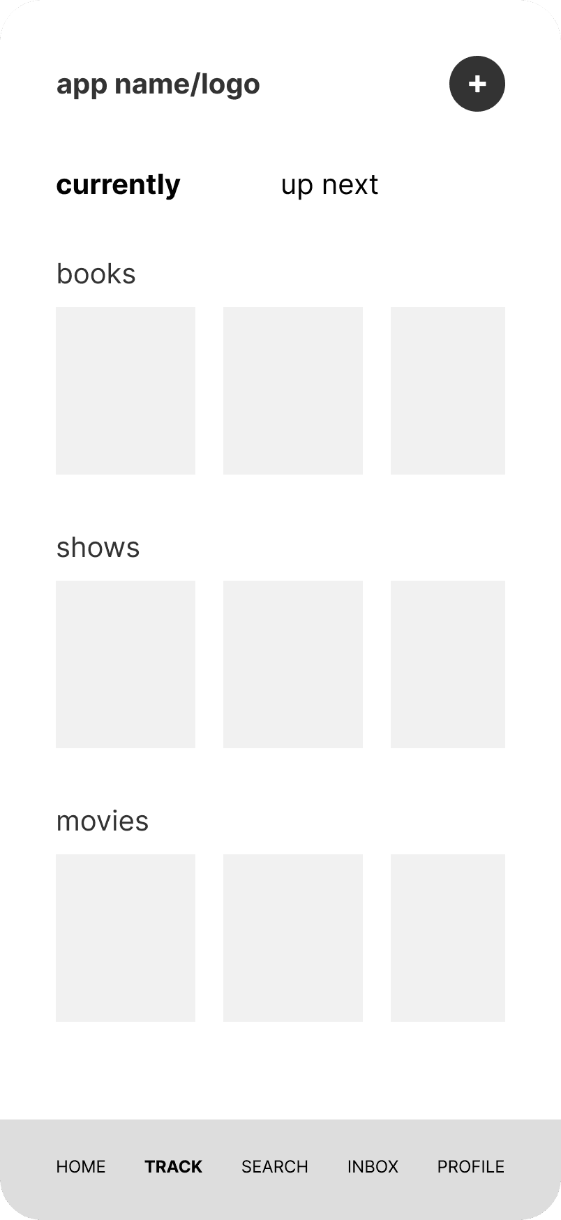
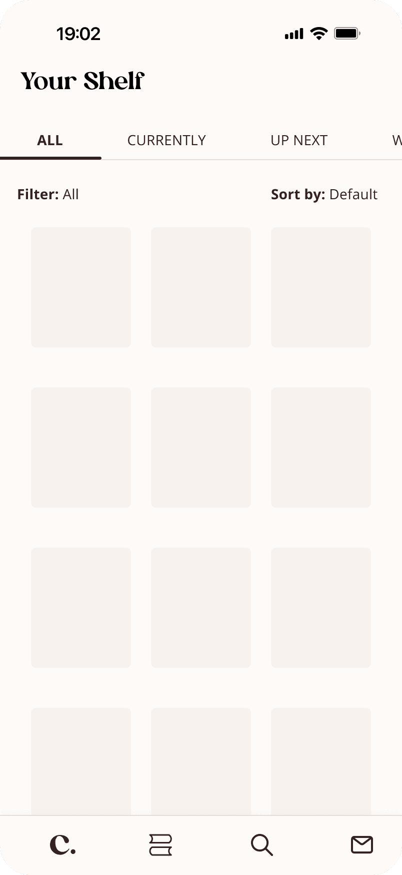
Maintained default tabs, while allowing users to create their own, with sorting and filtering options for further customization.
Up Next specifically supports a use case raised by participants: pre-release discussion threads.
Lo-Fi
Mid-Fi
02
Expanded profile features
Added recent user activity and external social media links to profiles, expanding the range of information users can choose to display.
03
Profile control
Allowed users to reorder and toggle profile sections on and off, so they can display what's relevant to them.
Designing
Building a hi-fi prototype for collectors and critics alike
Based on research findings, I refined the designs across Chronicle's four core interaction areas. The prototype below covers the complete experience — from onboarding through community, tracking, discovery, and profile.
Closing thoughts
What I learned
01
Supporting autonomy over prescription
Participants had vastly different organizational priorities that predefined features failed to adequately address; offering sufficient flexibility and customization provided a more effective experience.
What's next?
01
Explore cross-device consistency
The competitive audit also revealed inconsistent experiences for most products across devices. As such, developing a web version of this project would be a natural next step; a product with the goal of consolidation should include reliable cross-device functionality.
02
Additional testing + measuring success
Given the project's focus on social features, I prioritized designing and testing those interactions and micro-interactions over a more extensive research process. The current sample size limits generalizability, so conducting more usability tests, especially for the IA, would help in further validating successes and identifying areas for improvement.
I’d also love to conduct a diary study to see how the app fits into users' routines over time.
If I launched this product, I would love to evaluate feature adoption rates, conversion and customer retention rates, SUS, and various social interaction KPIs.

