Overview
PROJECT OVERVIEW.
Reckless Records is a London-based record store with three locations in Chicago. They do not currently do e-commerce, but their website does list all the records in their inventory, as well as vinyl record availability for each location.
Reckless Records’ inventory navigation is nearly entirely restricted to searches, with navigation for three general categories and informational links. Some links also redirect to a secondary version of their website with additional navigation items.
This project aims to enhance Reckless Records’ online presence and user experience by reworking their information architecture and content strategy. This proposal outlines our key recommendations to optimize the structure and content of their website, ensuring a seamless user journey and improved accessibility to their extensive record inventory.
OBJECTIVES & TIMELINE.
After assessing the current website, we aimed to define a new information architecture by merging and consolidating content from both versions of Reckless Records’ websites, ultimately simplifying users’ navigational experience. While, as noted, they do not currently do online sales, our goal was to set up the website in a way that would easily transfer over to an e-commerce format as well.
To do this, we created personas, conducted a content inventory, and free listing, followed by several rounds of testing, and finally, sitemaps and wireframes.
| 1: Define Personas | 2: Content Inventory | 3: Free Listing | 4: Card Sort 0-2 | 5: Sitemap Drat |
|---|---|---|---|---|
| 6: Tree Testing 0-2 | 7: Wireframes | 8: IA Testing | 9: Final Sitemap | |
Content Inventory
To prepare our content, we created a convent inventory of existing items and free listed as a group for additional items.
Our content inventory helped us establish a mutual understanding of all the existing content, and where they lead. We explored their existing navigation along with other clickable links in the sidebars and found the following:
- Reckless Records has two versions of their website.
- The first version is primarily used to navigate through their inventory items, and see which locations they are available at. This inventory is only navigable through a search.
- Almost every link on this website also redirects to their second website. This is where all of the other information lives, from gift card sales, to news updates.
- The second version also has its own links to the same menu items.
- They also had a third version of their UK website linked in the second version. We decided to focus our scope on the two American sites.
Accordingly, we learned that there were several duplicate navigational items scattered throughout the Reckless Records website. We aimed to consolidate the duplicates across each website. Most importantly, they lacked navigation for the most important part of their website: the records. As such, we also free listed some items to fill in this gap.
Click here to see the full Content Inventory in Google Sheets.
Personas & Scenarios
Meet Johnny, a music loving 18-year-old high school student with a limited budget. Johnny is a first-time user of Reckless Records, looking for affordable vinyl records to enhance his collection. He is eager to explore various genres and find hidden gems within his budget.
Johnny visits the Reckless Records website with curiosity and a limited budget. It’s his first time visiting their website and decides to explore the inventory to discover affordable vinyl options by looking at genres he is interested in. When Johnny finds an affordable and interesting vinyl record, he checks to see which location it’s available at.
Meet Ross, a 26-year-old individual who has an unlimited budget. Ross is spontaneous and likes to buy some of the featured vinyl records that look interesting. He is an existing user of Reckless Records and loves to discover new music.
Ross has been visiting Reckless Records for five years. He likes to check out their website to view the featured albums when he's not so busy with work or errands. He prefers to go to the Reckless Records Loop location, so he goes to search through that store’s inventory. From there, he explores the featured vinyl records that are available at that location.
Open Card Sorts
PILOT CARD SORT
Our pilot card sort had five categories with a total of 30 cards. Three users completed this study, with additional feedback in class by peers.
Findings and Changes
Most prominently, users noted that the distinction between two of the categories was unclear. This was evidenced by the fact that several cards we expected in each category were interchangeably misplaced. Several other card names were also deemed vague, and misplaced into an incorrect category. Given these results, we decided to make the following changes:
- We decreased how many cards we had in order to push some of them into a third level category, instead of forcing everything into a second level.
- We also changed the phrasing of several categories and cards. Notably, we changed the “News” category to “Important Updates.”
At this point of our research, we likely could have benefitted from a hybrid sort to gather a more informative range of user input.
FIRST CARD SORT
The first card sort had five categories with 22 cards. 24 users completed this study. We also included a questionnaire for additional feedback.
Findings and Changes
Two different categories also had cards interchangeably misplaced this round; this confusion was also confirmed in the post-study questions. We made these changes following this round:
- We changed a few more category and card names in order to increase clarity. Notably, “Merch” was changed to “Gifts & Apparel.” We also changed “Shop by Size” to “Shop by Record Size.”
- We also specified in the introduction what sort of website this study was being conducted for, and added a screen to ensure users had some familiarity with vinyls to any extent; some had expressed in the post-study questions that they did not know what a vinyl was.
SECOND CARD SORT
Our final card sort also had five categories with 22 cards. 10 users completed this study.
Findings and Changes
This round was our most successful and confirmed the effectiveness of our prior changes; the phrasing changes from round 1 led to users placing items into the “Gifts & Apparel” and “Vinyl Records” categories much more accurately, and “Shop by Record Size” was also placed successfully by all users.
Information Architecture Testing
PILOT TREEJACK
Our pilot tree test had six tasks. This study was completed in class, with feedback from our professor and peers.
Findings and Changes
We discovered a lot at this stage of our research! In class feedback and testing revealed the following insights:
- Our second task was phrased awkwardly, and as such, we altered our phrasing.
- Our third task did not clearly portray our intention, and primed users to click into a specific level. Accordingly, we rephrased this task to remove the primer.
- Our sixth task was related to genres, and we learned that this was likely unnatural for users, as they do not often think in genres. As such, we saved this task for our subsequent first click testing.
We also received some general feedback on our information architecture:
- While we had already narrowed our second level navigation, we discovered some of our categories would be better suited as filters or search queries, such as with genres, artists, and record sizes. As such, we removed those and left them for the wireframes.
- We also discovered that the phrasing of “Gifts & Apparel” was still not entirely accurate for the content we had under that level, and “Merch & Apparel” would be a more fitting phrasing.
- Finally, we moved our FAQ up one level.
FIRST TREEJACK
Our first tree test had five tasks. 20 users completed this study.
Findings and Changes
This study had an overall success rate of 91%, excluding the first exploratory task. The first tree test revealed the following insights:
- Task 2 had a 90% success rate. The remaining users chose paths that were not related to the location we directed to, and none were ones we deemed could be considered correct.
- Excluding the exploratory task, we discovered that task 3 had the lowest success rate, at 85%. However, upon review, these users had selected a path we deemed valid, so for the second treejack, we set it to count Home → Vinyl Records → Shop All as a correct path.
- Task 4 and 5 both had a 95% success rate, with one participant choosing a completely different path unrelated to the task.
Beyond adding a correct path to task 3, we decided to not change the other tasks that had a 90% to 95% success rate, and reran them as is to validate our findings.
SECOND TREEJACK
Our final tree test had five tasks. 11 users completed this study.
Findings and Changes
This study had an overall success rate of 100%, excluding the first exploratory task. The second tree test revealed the following insights:
- Tasks 2 through 5 had the highest success rates at 100%. All of our users chose the correct paths for each of these tasks.
- Five users took indirect paths for Task 3, with four of them heading to one of the right options before going to the alternative option.
These findings helped us validate our previous tree test and current sitemap.
First Click Testing
Our Chalkmark test had a total of two tasks. Eight users completed this study.
Findings and Changes
Our biggest finding from this study was to increase the clickable area/hitbox for our first task! Users were selecting areas that, on an interactive wireframe, would likely be clickable, but we did not properly consider that when designing the Chalkmark. We also learned that some users prefer to search from any page, even with other relevant features available, and that should be included as a valid option. Other than that, most users clicked our anticipated areas.
Sitemap
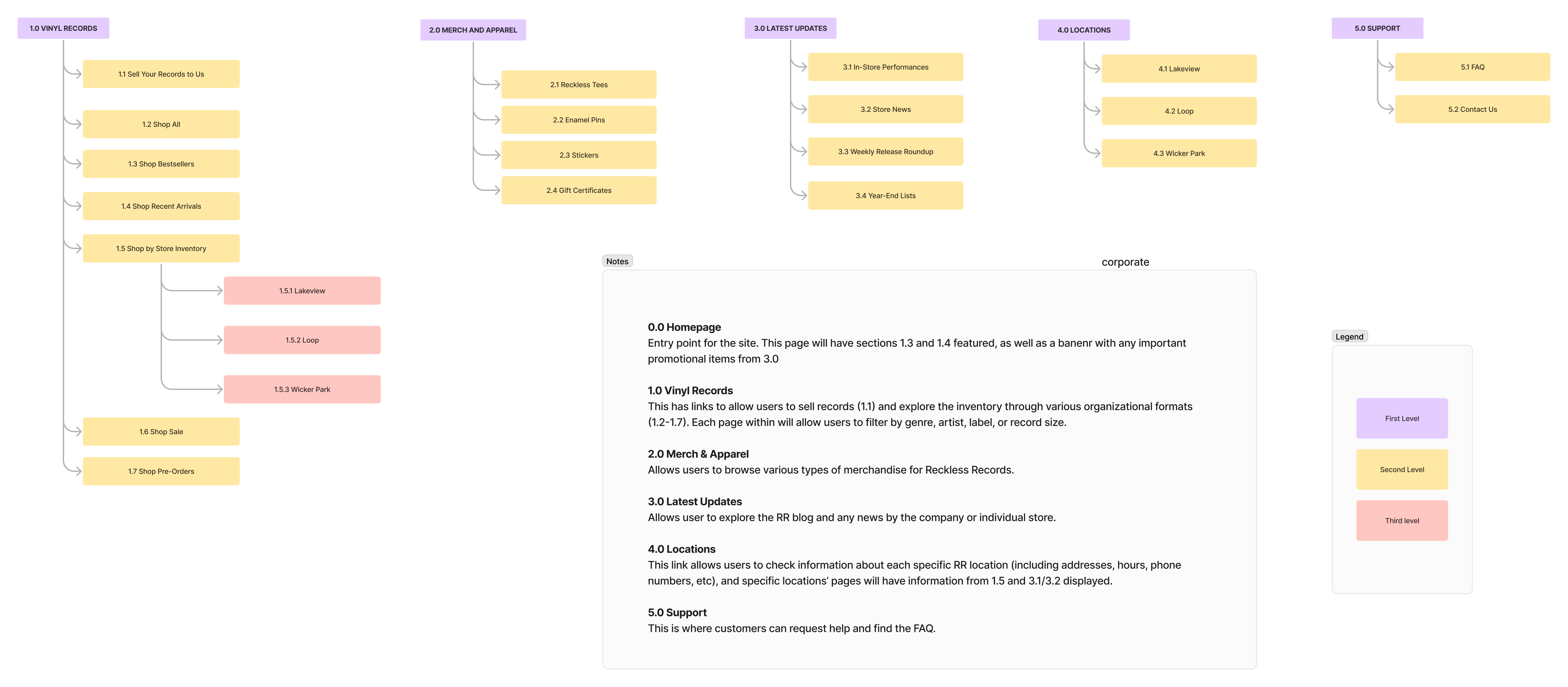
This is the final version of the sitemap we created, incorporating all of the feedback from previous rounds of testing. The biggest changes included the removal of several categories under 1.0, which we determined were better suited as sorting or filter options, in addition to the renaming of categories 2.0, 3.0, and 5.0.

Wireframes
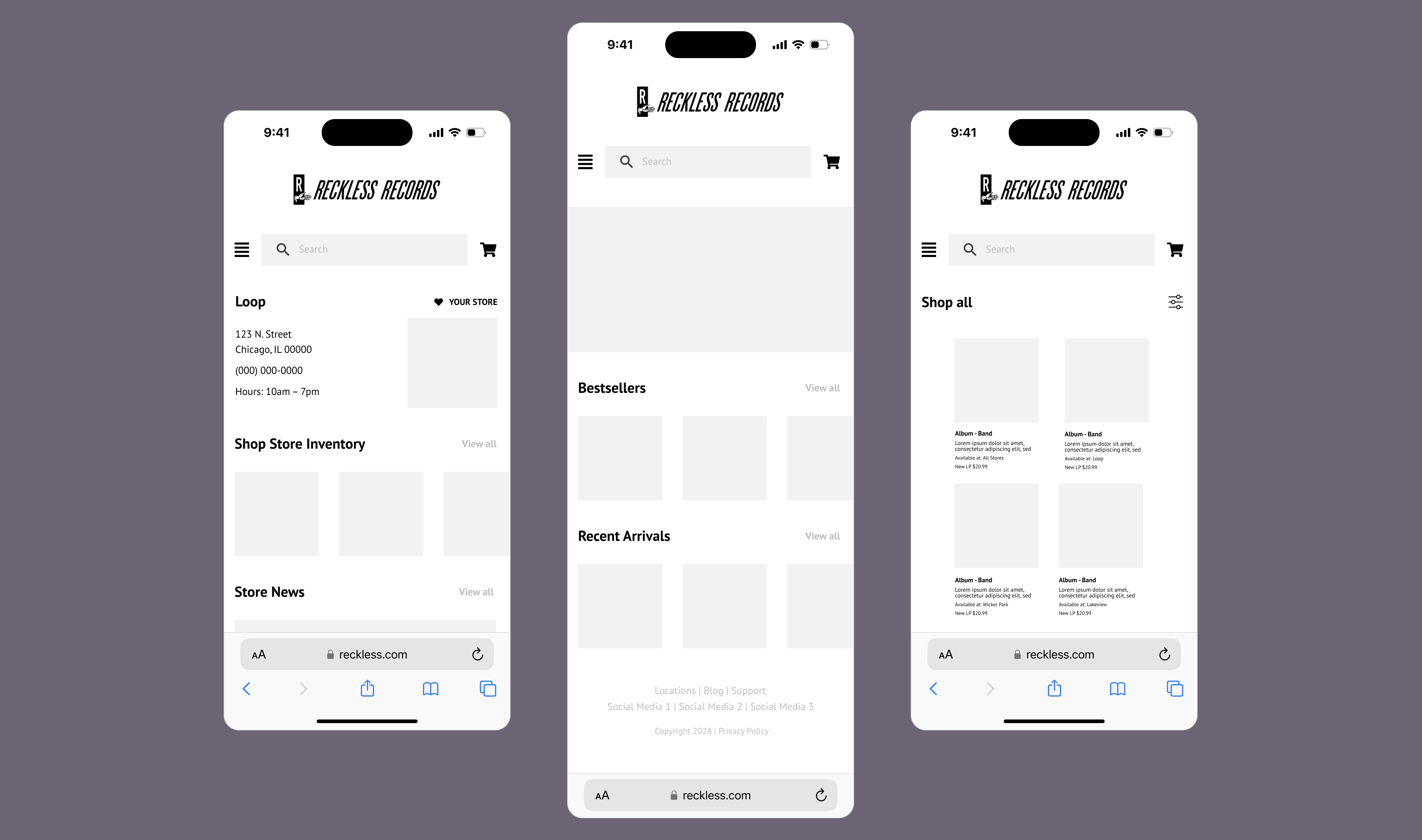
Overall, the designing process was fairly successful! Considering we scrapped some initial navigation items from both the content inventory of their existing website, as well as our early sitemaps, we had several pieces of content prepared for the wires. As noted, however, we did run into some issues with the design of the Chalkmark areas, but the wires themselves seemed to be clear and understandable to users.
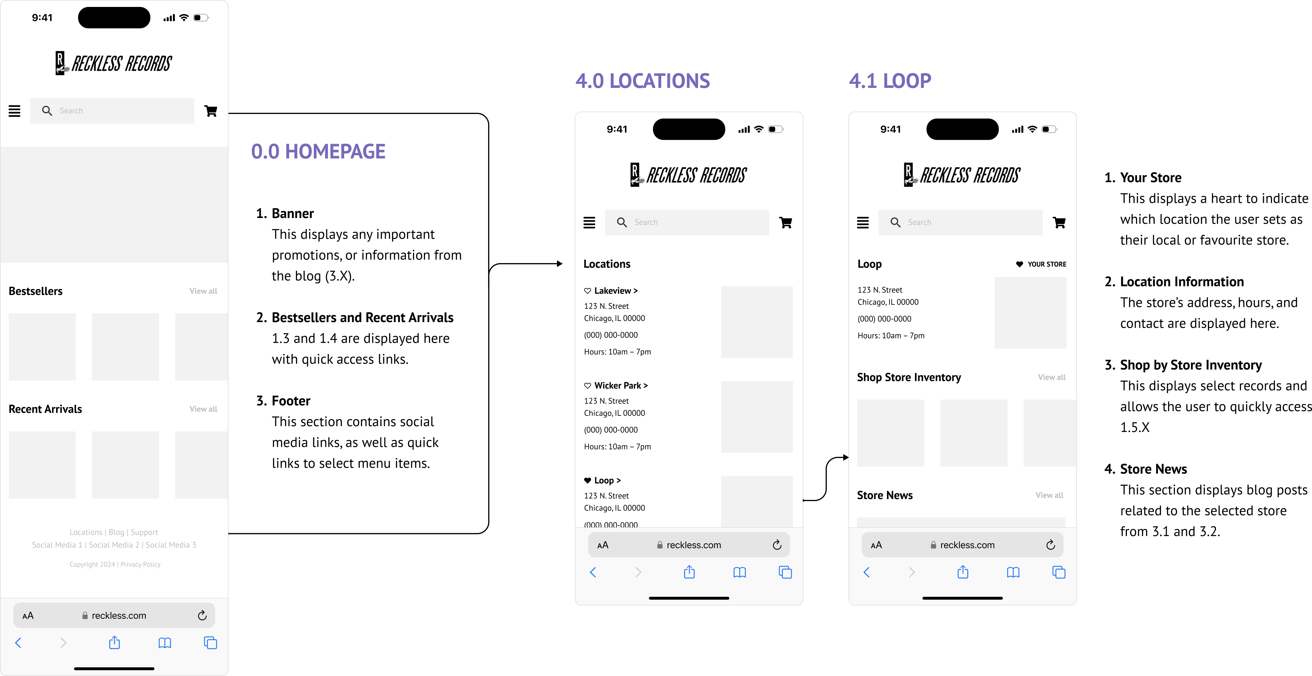
KEY TASK FLOW 1: FINDING LOCATION INFORMATION
The goal of this wireframe was to create a more direct path to the location information than the existing website. Our wireframe also consolidated additional information about each location that was previously scattered, such as a store’s news or inventory. One change we made here between iterations was the addition of the “favorite store” feature, which would especially benefit users when going through different task flows.

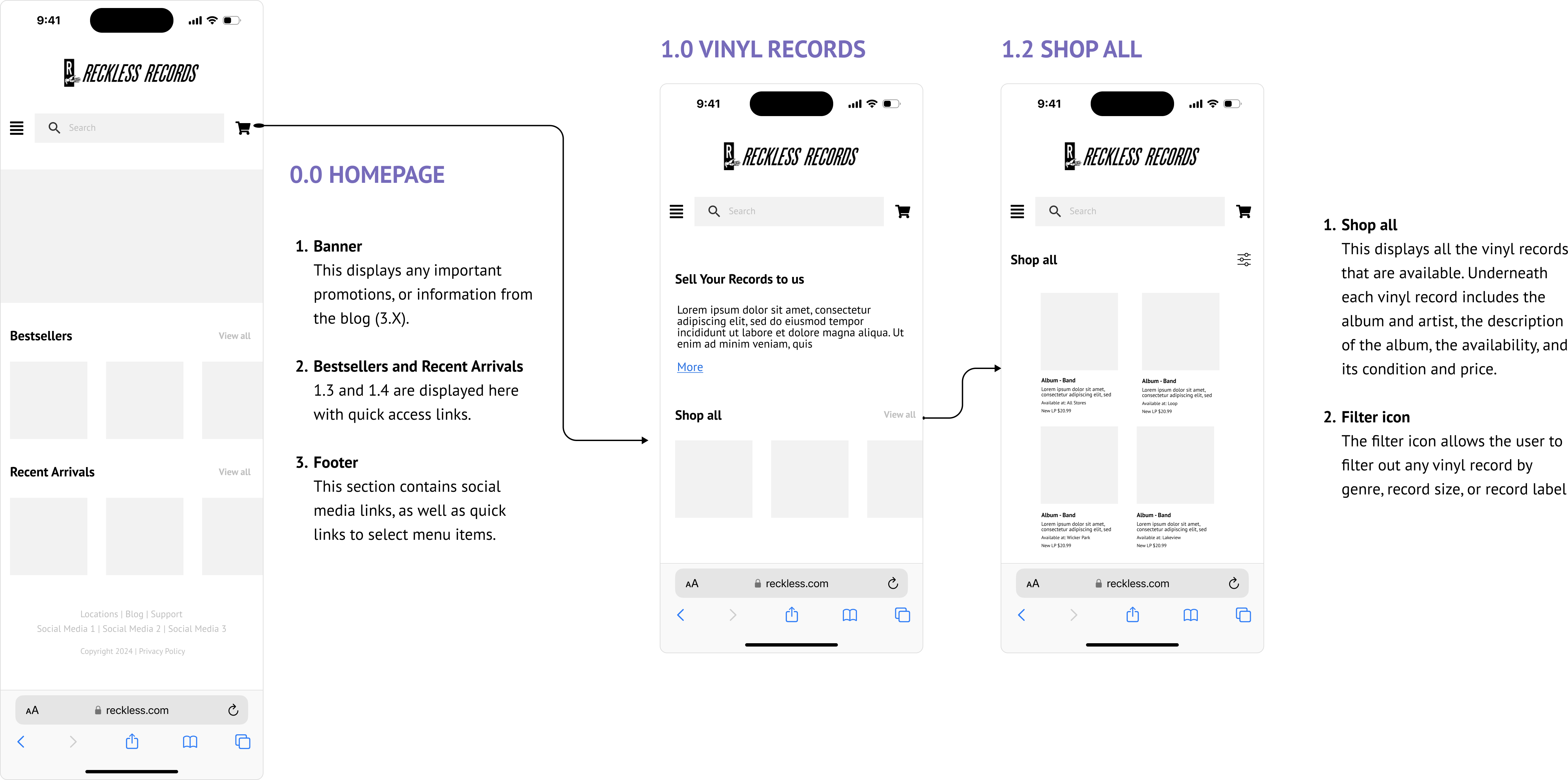
KEY TASK FLOW 2: SHOPPING FOR RECORDS
Here, we aimed to provide access to all available records on the same website as everything else (no second version this time!). We also added functionality to shop by specific preferences (e.g. genres or record sizes) on the same page through sorting or filtering, rather than through the navigation.

Retrospective
TOOLS
- Excel: Drafted our sitemap and content inventory
- Optimal Workshop: Card sorting, tree testing, and information architecure testing
- FigJam: Final sitemap and annotations
- Figma: Wireframes and annotations
TAKEAWAYS
The biggest thing we learned was what deserves to be in the navigation and what is better suited to be a filter or other user tool on a page. In our initial free listing and card sorts, we tried to include features like genre as second and third level navigation items. By the tree test, we realized that made the information architecture and user tests more confusing for both users and us as designers. In other words, what we thought would be a beneficial path was, in fact, more complicated; while this is not new information to us, it does reinforce the importance of user testing as we are far more familiar with the product than a user would be.
Our studies also had an inconsistent amount of participants; some had a lot, while others had very few. We also struggled to get participants for some of them initially. Because some tests also overlapped, we could not adequately or fully utilize the built-in redirect on Optimal. Partly as a result of this, we also did not establish the clearest duration to run each test. In the future, it would be beneficial for us to find a more consistent recruitment approach. More generally, this helped us understand the importance of carefully planning every step of the process, especially for IA testing and design.
Beyond this, the project went smoothly and we learned a lot about what information architecture development and testing involves, and the extent of its importance to a website. Conducting with content inventories, tree testing, card sorts, and first click testing, as well as using Optimal as a tool was also new to all of us and incredibly interesting to learn, and will be incredibly beneficial to our future work.
NEXT STEPS
Most importantly, there is always room for further user testing to explore potential for refinements. For this, it would also be beneficial if we recruit participants who shop at any of the Reckless Records store locations in Chicago to receive better results.
Including a larger sample size of our targeted audience will help us with validating our findings for the card sorts, treejack tests, and first click testing. For example, our treejack tests had high success rates and we would like to confirm the results in the near future.
This final version also only had a single round of first click testing, with two tasks. It would be worth testing our two task flows with additional prompts to ensure how efficient they are for other potential task flows. Similarly, it would also be beneficial to build out more task flows.
