Overview
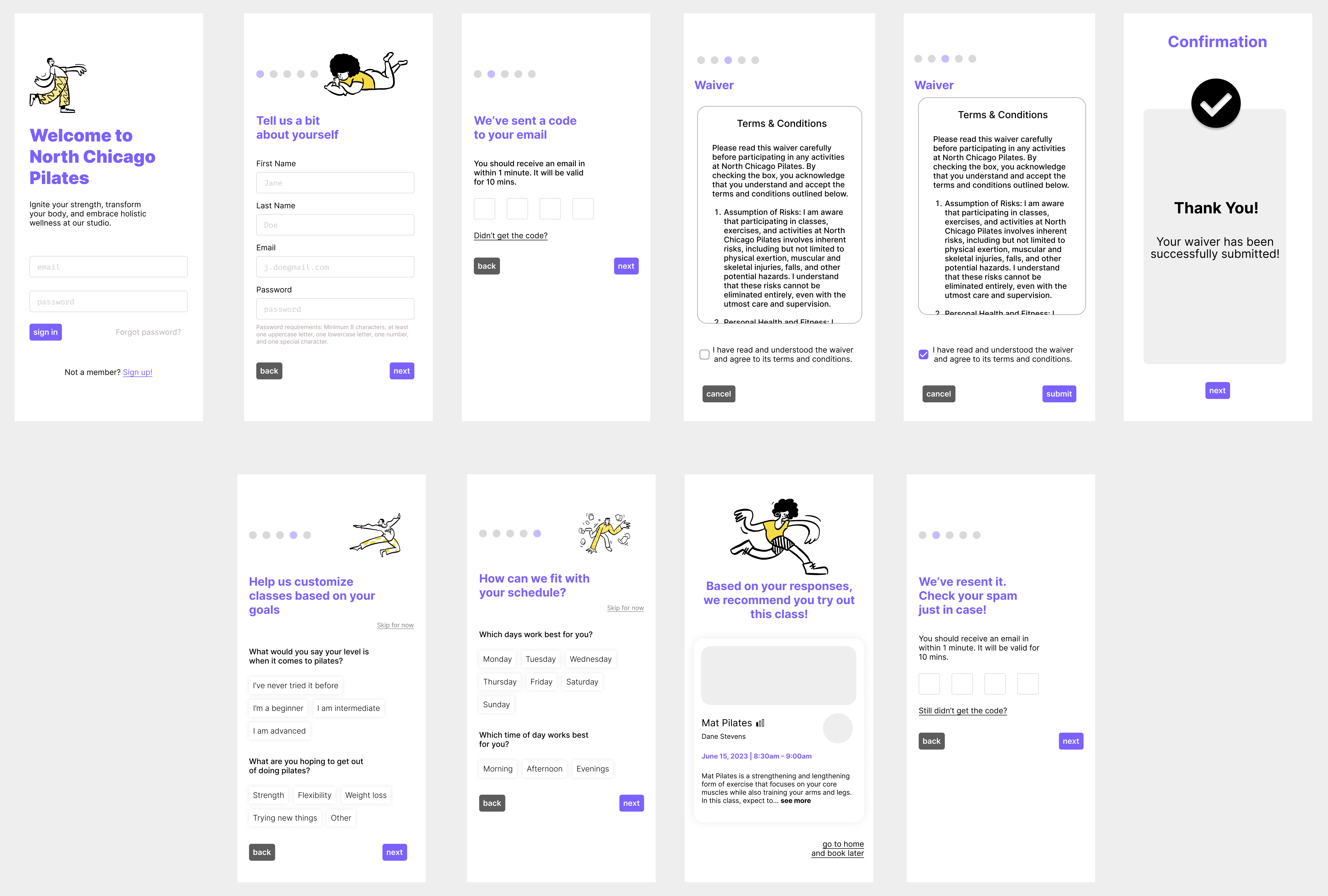
My team and I spent our time in HCI 440 building an integrated pilates experience for a fictional studio, North Chicago Pilates, that allows for easy class booking and management through a mobile app.
The Problem. Class registration can be difficult; registering for classes can require too much time spent at the front desk of a gym, pricing and payment transparency is lacking, clarity for class time and what to bring to a class is lacking, and the time spent searching for classes can be too much.
The Goal. Help users feel empowered, excited, and in control of their personal fitness experience, and create a transparent and trustworthy class purchasing experience.
Understanding the User: Personas
We conducted a total of eight contextual inquiries and created the following personas by consolidating what we learned:
Meet Jill, a 24-year-old graduate student who is interested in signing up for a class at North Chicago Pilates after hearing her best friend rave about how transformative the classes were for strength and posture. Despite trusting her friend, Jill has always been a cautious person who always does her research before committing to anything. She believes strongly in trying things out before committing as she is careful with her money as she is still a student. As she is a student, finding a class time that works with her class schedules and extracurriculars is also important to her.
Meet Luca, a 31-year-old grammar school teacher and regular Pilates student at the North Chicago Pilates Studio. Luca has been practicing Pilates at the studio for the past year, and now he is seeking to challenge himself more with a more intense Pilates class. He doesn’t want to rush and pick a class too advanced for himself, so during his breaks at work, Luca browses through the “recommended for you” classes on the application to view the descriptions, instructor ratings, and schedules for different classes. When a class sparks his interests, he saves them to his “favorites” to review at a later time.
Understanding the User: Concept Analysis
From these interviews, we also created a concept analysis table, as shown below. Additionally, we created a list of functional, social, quality, and data requirements.
| Concept | Attribute | Operations |
|---|---|---|
| User | ||
| Class | class type, instructor, location, length/duration, difficulty, cost | check in, share, view, search for, favorite |
| Gym | proximity, address, hours, parking info, gym info | navigate, share, view, check-in |
| Location | address (street, zip), phone number | view |
| Reservation | time, day, availability | make, cancel, view |
| Instructor | name, availability, specialization/certifications | contact, view |
| Account | favorites, saved classes, bookings, username, password, payment info, user info (phone, email) | view, edit, sign up, delete, view |
| Payment | credit card number, name, address | add, remove, update info, view |
| Membership | price, name, acc number, membership type | pause, cancel, renew, join, view |
| Feedback | instructor, student, feedback info | view |
| Item | item type (health supplements, apparel), price, size, quantity | buy, reserve, share, view |
User Testing and Results
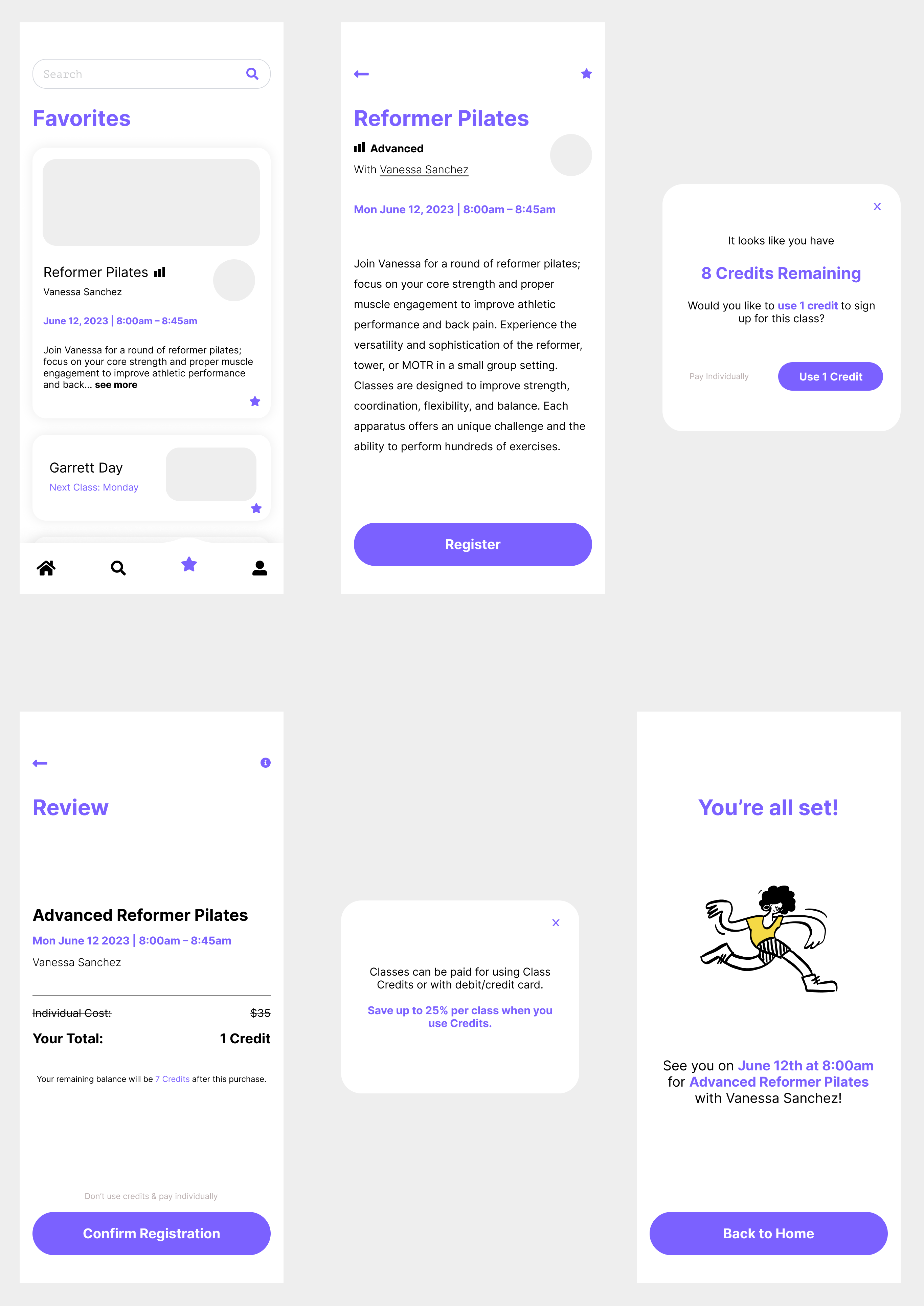
After creating our first prototype, we conducted another eight user tests for two specific user flows: new users and returning users. We had new users sign up for a new account and input preferences and get recommendations for their first class, while returning users signed up for a class using credits through the class favorites page. Our key findings were the following:
- The sign needed to be more visible, since many users assumed that the text fields were for signing up, not signing in.
- The class card needed to be clickable instead of just the “read more” link and the description, since many users did not know where to click to view the page.
- The password requirements for the text could be bigger; some users immediately began typing without reading them.
- The favorites page star icon in the navbar may be ambiguous since one user did not click it when trying to find the favorites page.
- Many users liked the layout of the page. They said it was not too complicated and that it felt similar to other applications’ they’ve used.
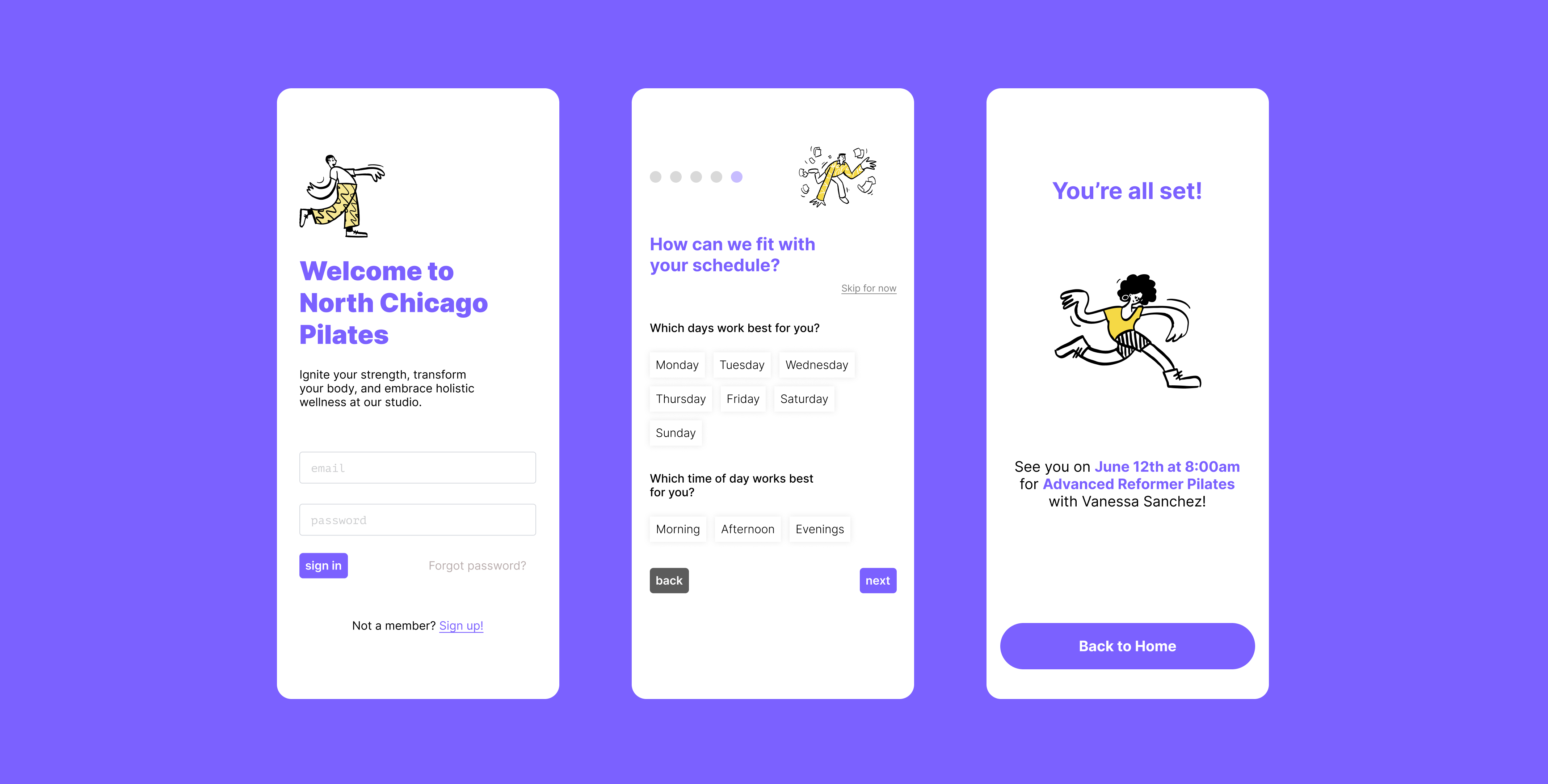
We made changes to our prototype design according to these findings, as shown below.


Takeaways & Next Steps
The value of contextual inquiries was definitely strengthened for us; going into this project, we expected users to be interested in having the ability to communicate with instructors outside of class, but we found the opposite to be true. Additionally, there were four of us working on this project, and we realised after completing our interviews that using data capturing tools like Airtable would have simplified our data consolidation process. The importance of CTAs for users was also strongly reinforced for us! Our onboarding and card actionability both lacked clear enough CTAs, as discovered through our user testing. For our next steps, we hope to create a version of this project that is fully built outside of these two specific user flows.
