Overview
During the Pratt Institute Graphic Design Intensive, to choose which product to redesign, we just walked around a nearby grocery store and picked something up. This made for an interesting process as I had no prior knowledge of the brand or its mission, and only a day to finish it.
Research, Ideation, & Process
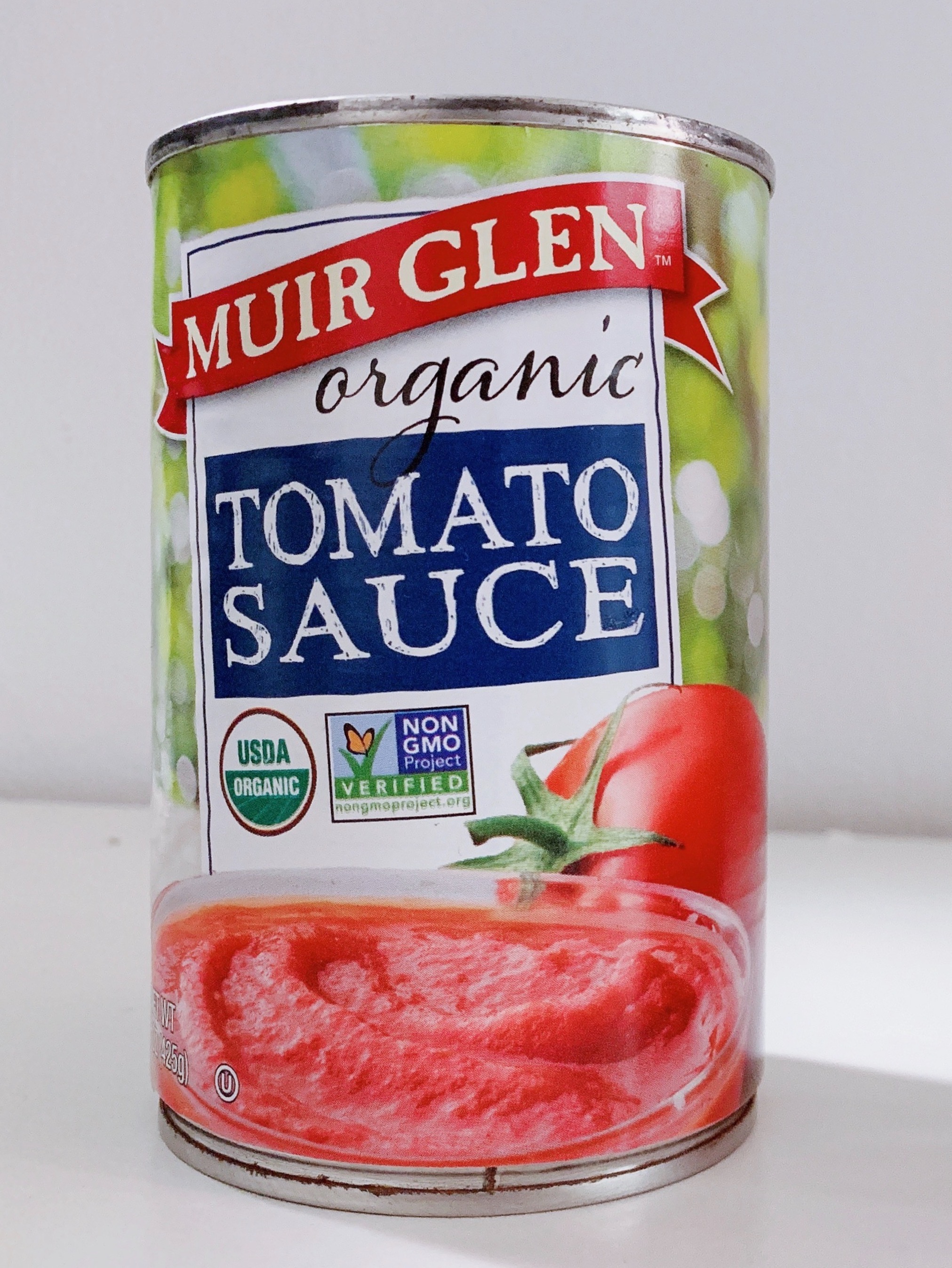
As you can see in the image at the bottom, the package had a rather unappealing image of tomato paste. Upon a closer look, I found that the product was BPA free, Non-GMO, organic, vegan, and gluten free, and checking their website also showed their committment to these. The package, however, did very little to highlight all of this, especially since most of this information was hidden at the back of the can, and the design itself didn't help either (courtesy of the paste). The colours also did not make it stand out on the shelf against its competitors.
Branding
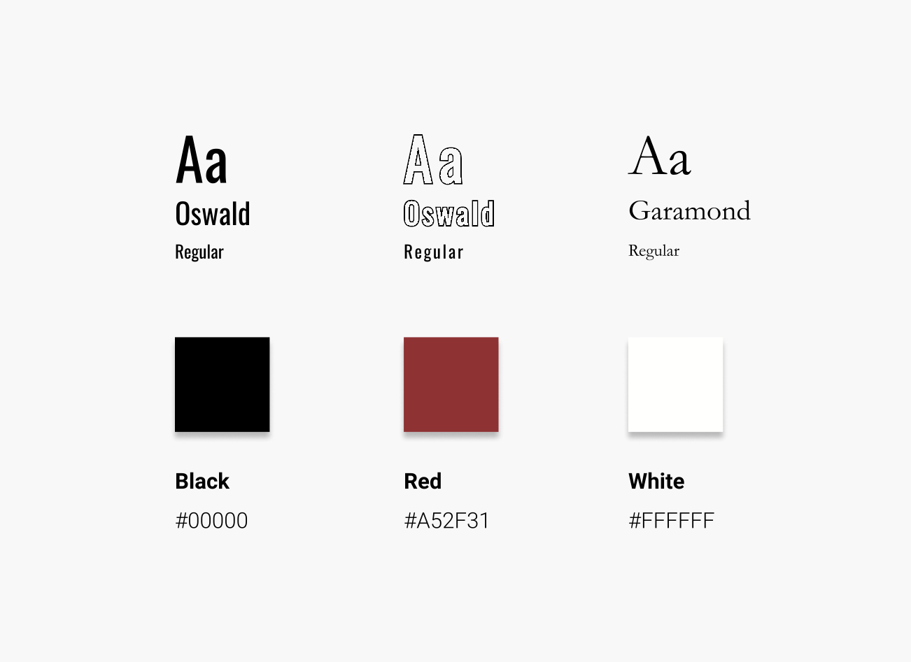
I took inspiration from the original design–I kept the whites and reds, and a rustic font, in addition to a more modern looking one.
Final Product
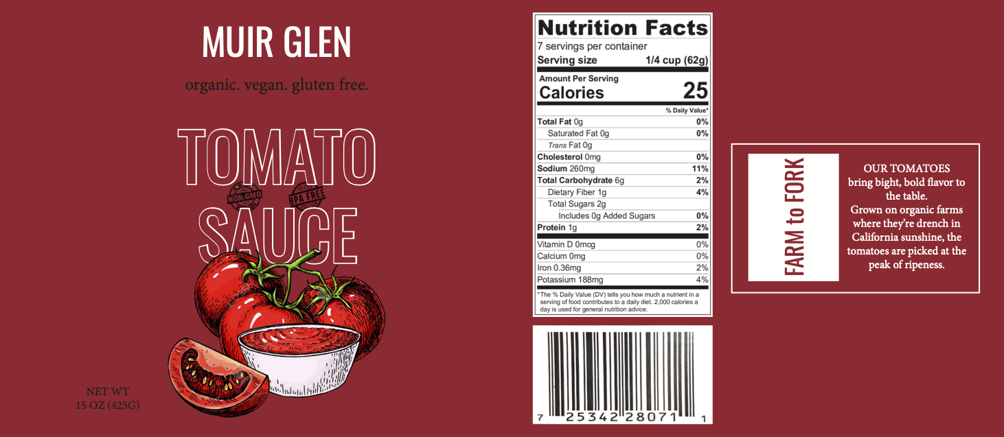
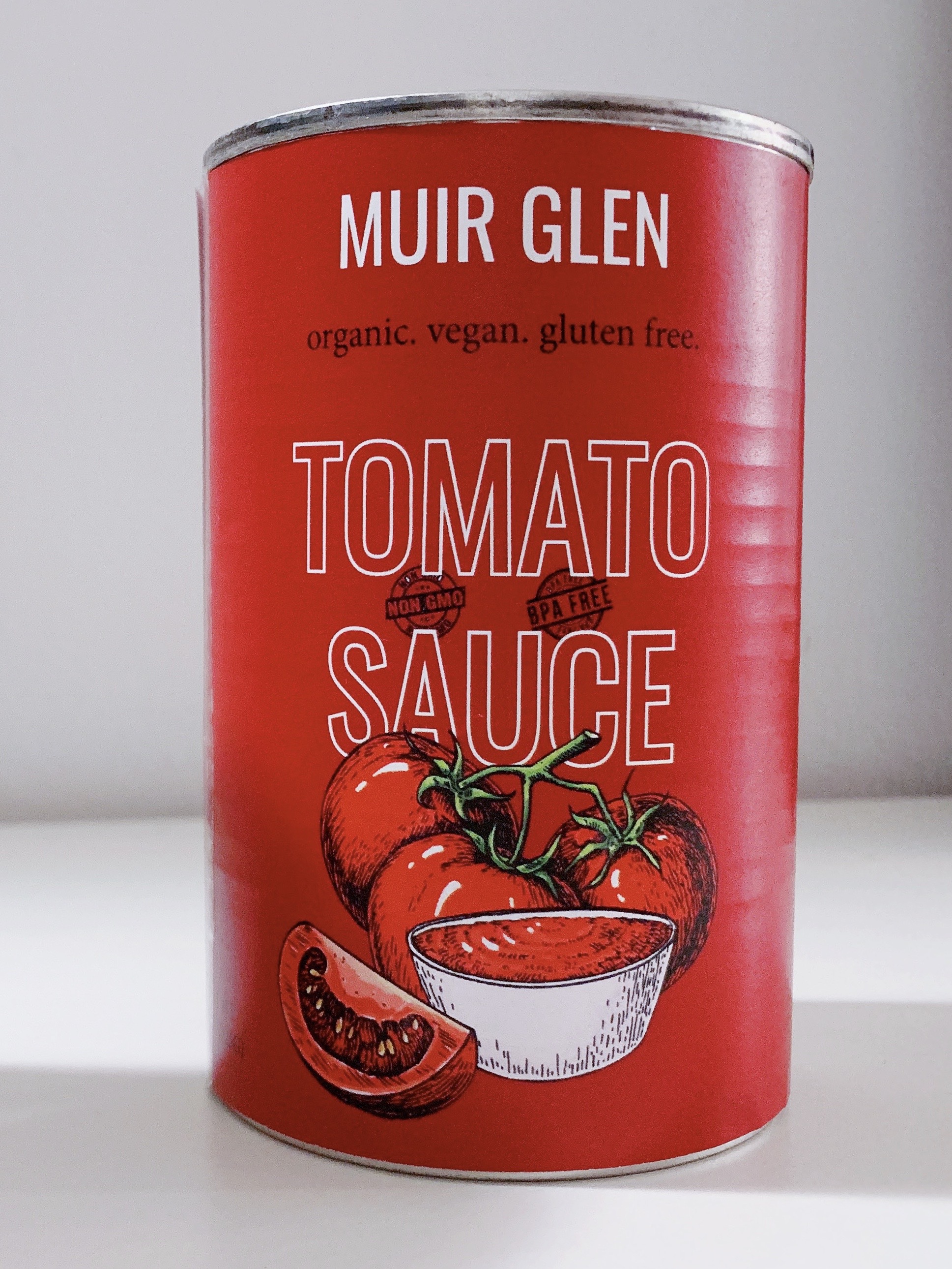
I decided on using graphics instead of actual photographs to aid the product's natural characteristics. I also used a serif font to give it a down-to-earth feeling, and a sans-serif one for a fresher look.
