Rebranding a local live music & events venue.
A little about the project
For my final project in the Pratt Institute Graphic Design Intensive, I worked on rebranding the Canopy Club, a local events venue in the Champaign-Urbana area. Canopy Club is at the edge of Urbana, while most of its competitors are closer to the heart of the Univeristy of Illinois campus, almost a mile away in Champaign. The primary function of the venue is for live events, but it's also a pub that hosts game nights and other events, and serves food from neighbouring restaurants. However, it doesn't advertise the latter opportunities as much as it can, and generally doesn't draw the attention of those who aren't concert-goers
The neighbourhood
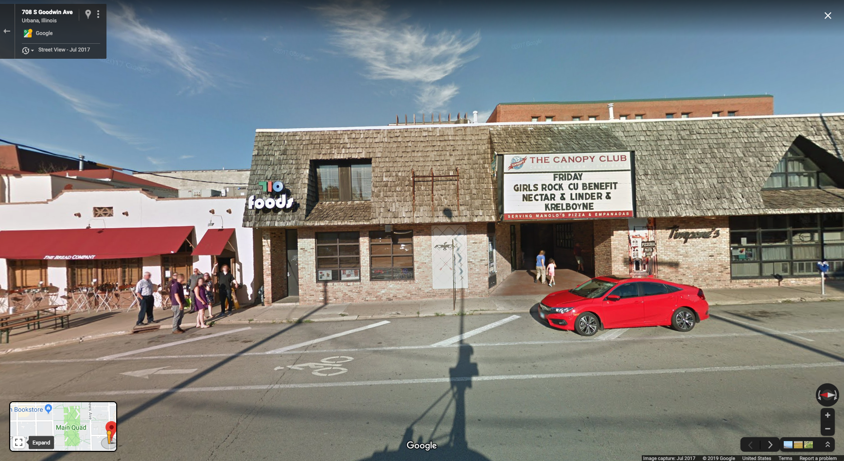
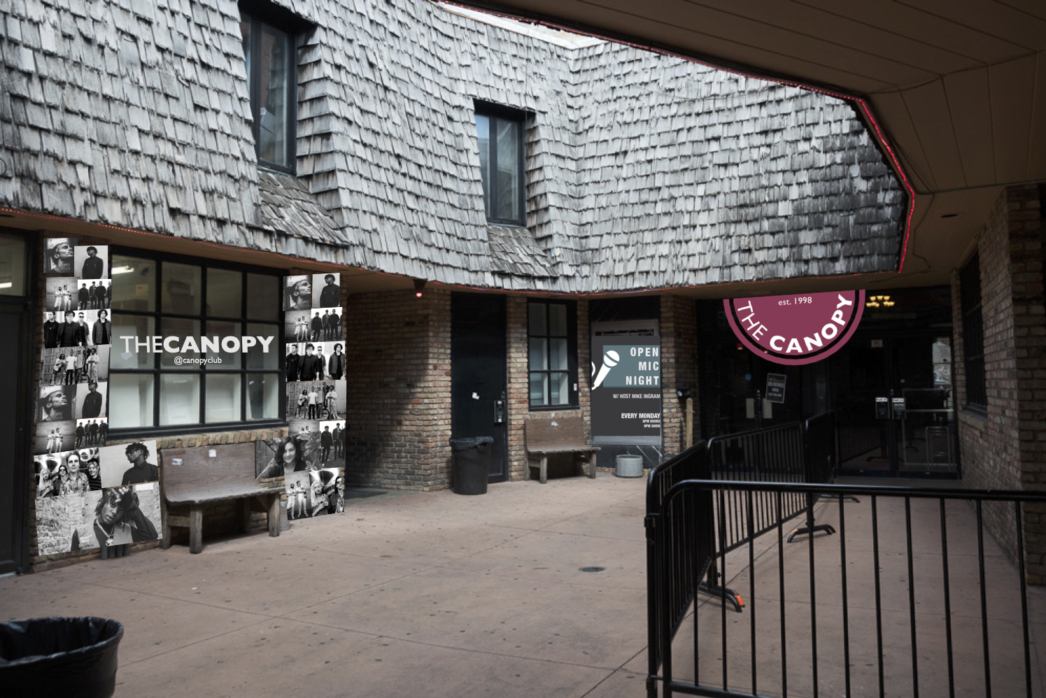
The Canopy Club is tucked away in an alley past an Urbana sidewalk as part of an older construction. As such, little can be done to the building itself, but I did see opportunities for improvement along the streetside with the marquee board and other signage. Though not pictured here, I also thought the courtyard area could some redecorating; taking pictures at bars and concerts is incredibly common, and the Canopy currently does not have any unique areas for photographs like its local competitors do.
What's the goal for the rebranding?
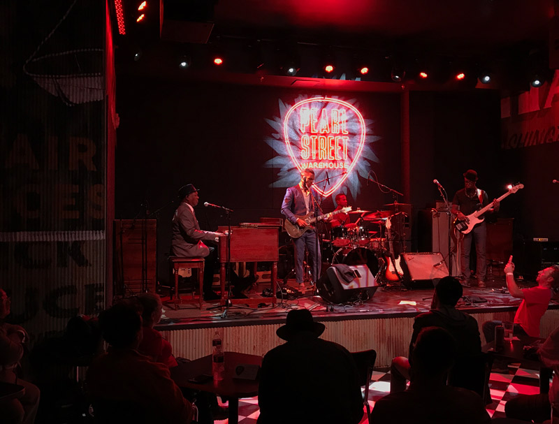
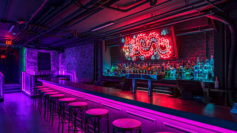
I took to the neon aesthetic of clubs as inspiration for modernising the Canopy. I couldn't physically redesign the interior of the venue, but if I could, this is what I would want it to look like!
Adapting the inspiration to the brand
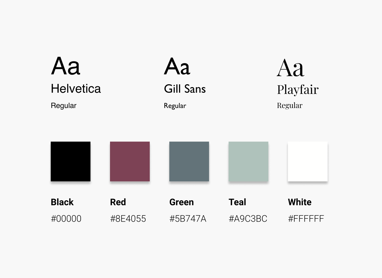
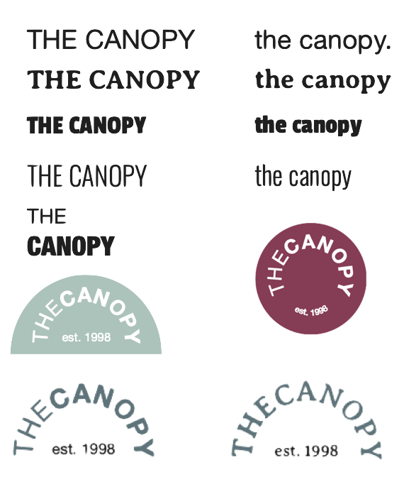
My goal for the new identity of the Canopy Club was a more mature aesthetic, while still being fun and colourful–inspired by the images above. The intent of the muted colours to achieve the former, and the variety of colours, arched logo, and footer accent font of Playfair sought to do the latter. I also tested out a few different logo options before settling on the current red arc with text inside!
What are you doing this Tuesday?
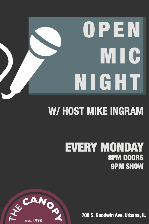
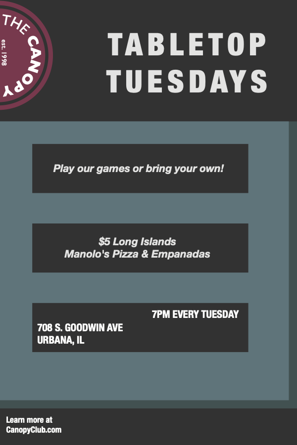
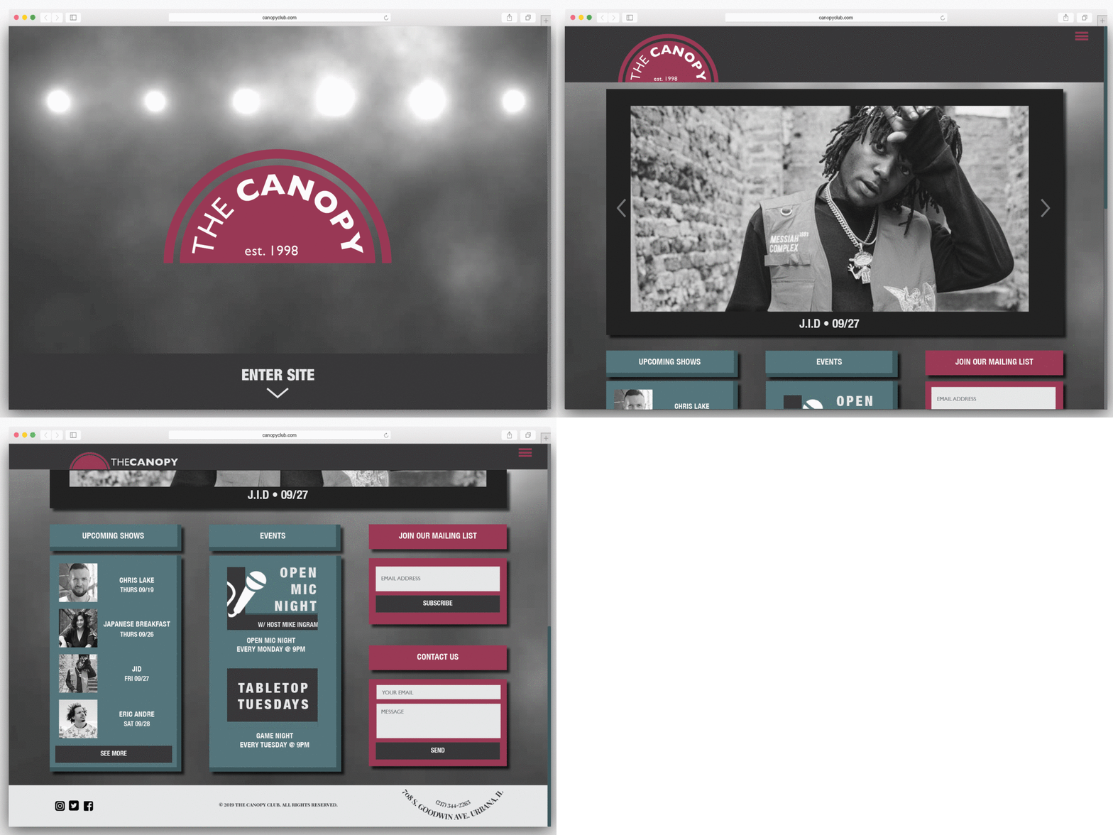
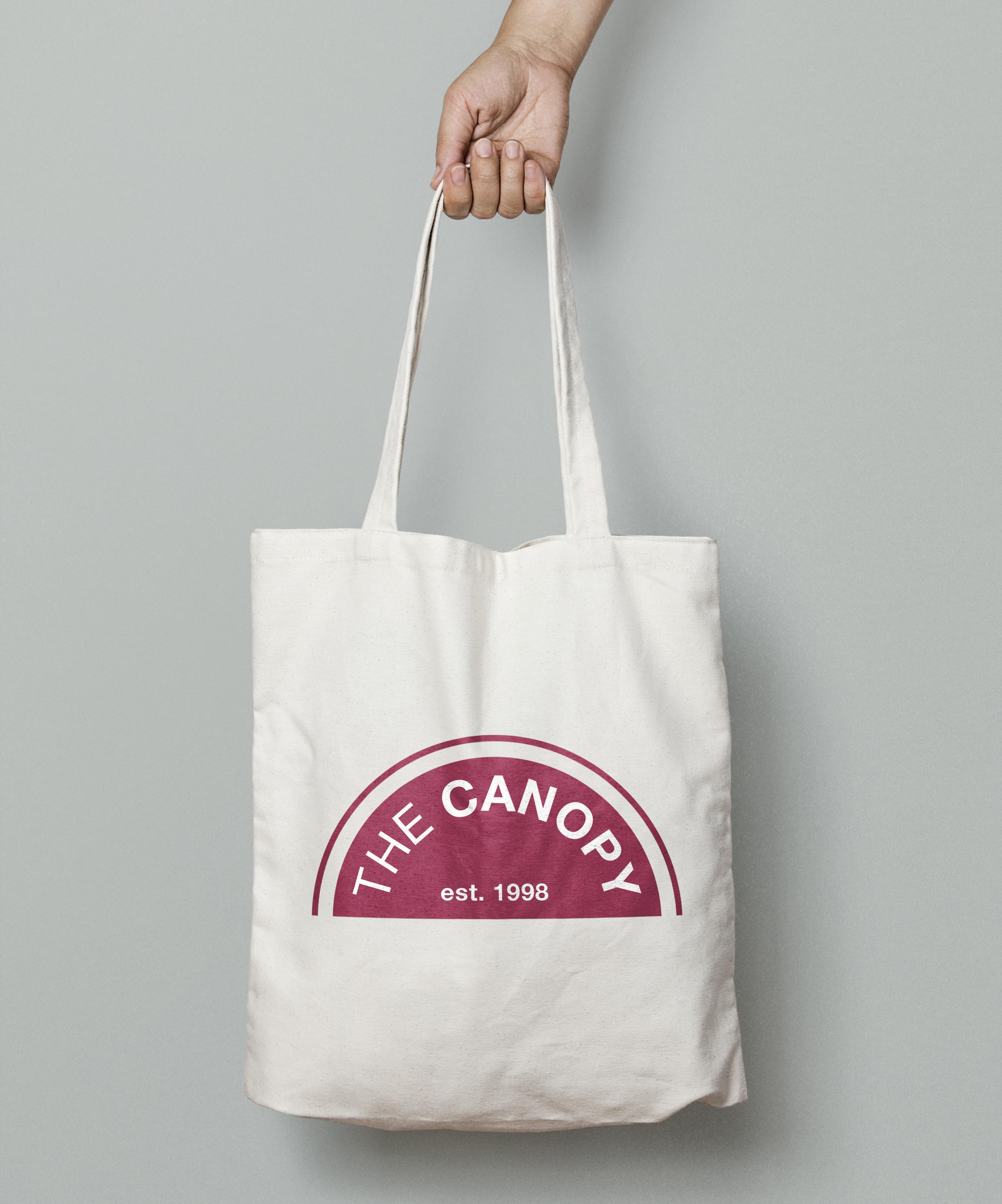
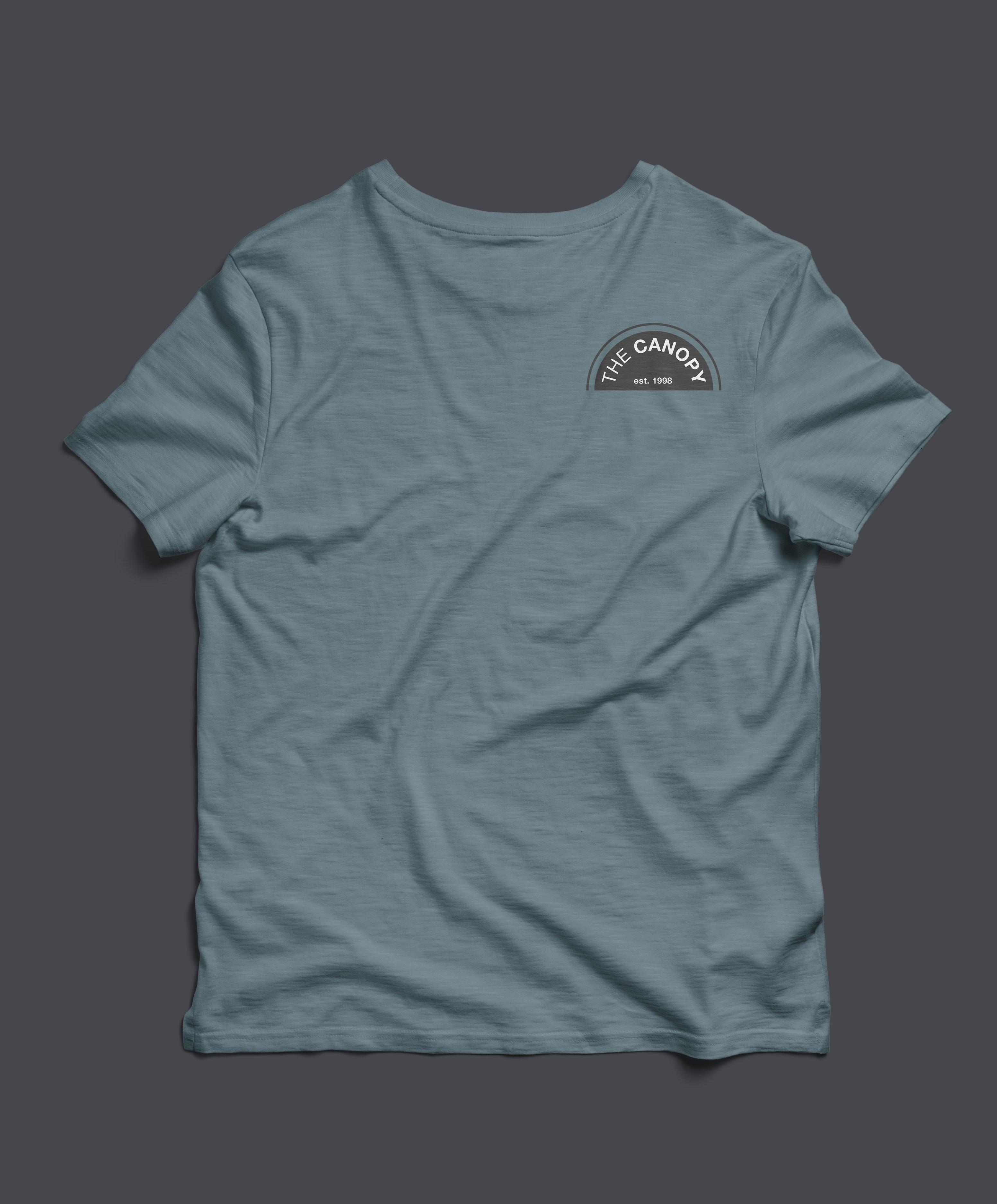
My end result included a few mockups for potential flyers and the website, created using Adobe InDesign, and a tote bag & tee using Photoshop.
Oh, I love that place!
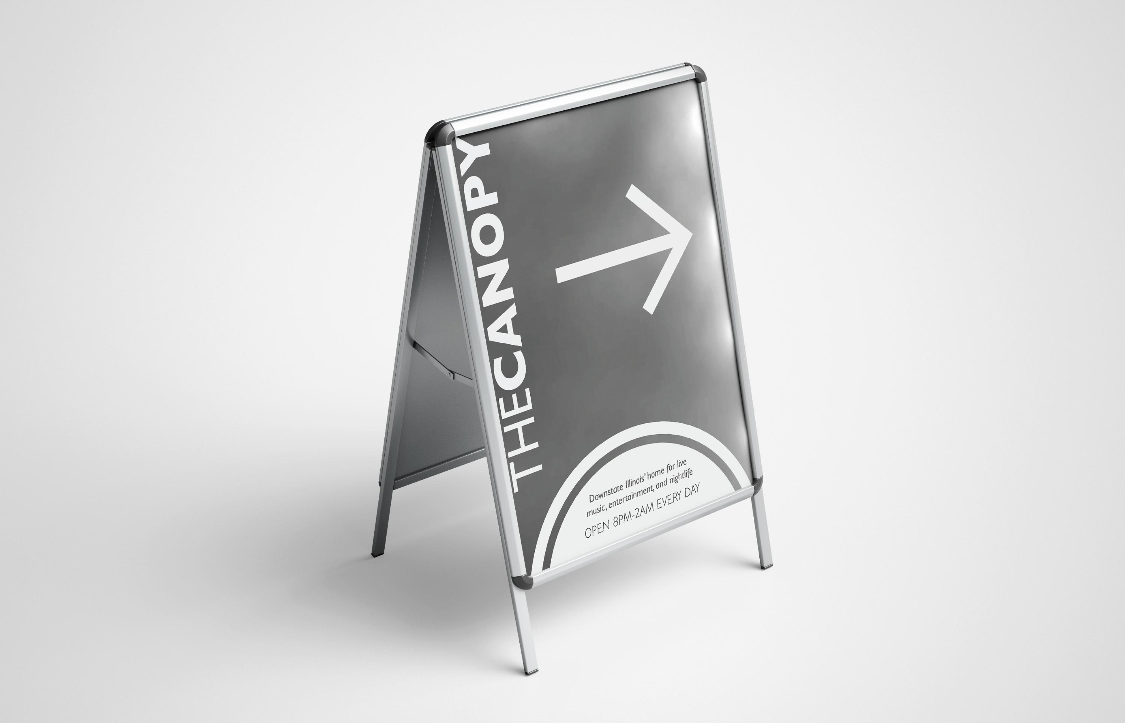
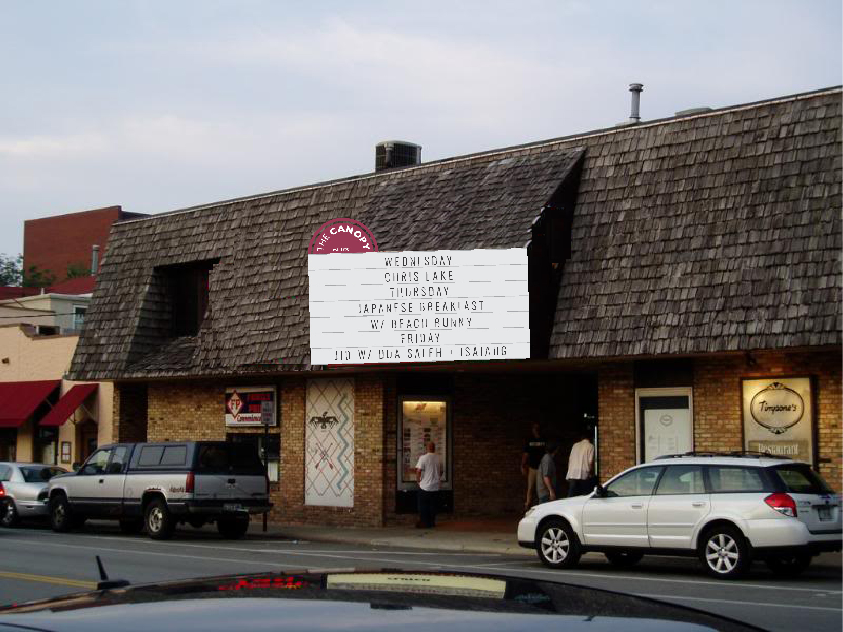
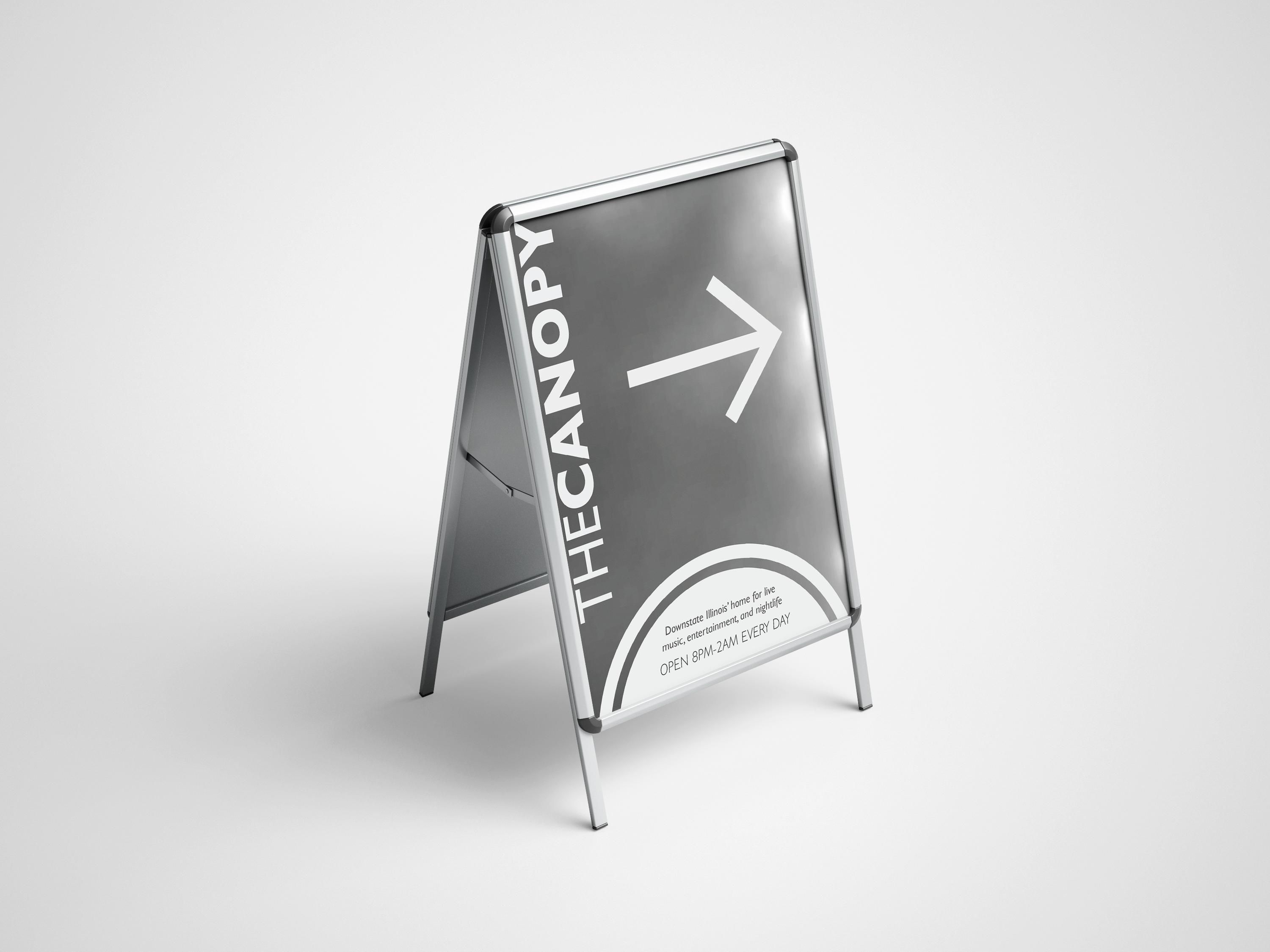
I also redesigned the marquee board and courtyard, and created an A-frame stand using Illustrator and Photoshop! These were some of my first experiences with these tools, so the execution isn't as crisp as I'd like, but the sentiment is there :)
What did I learn, and what's next?
✽ I didn't have much prior experience using these tools, so this definitely helped me establish a solid foundation. I plan on recreating these in the future to see how I can improve and expand upon these designs and ideas! Especially the website, considering my knowledge of UX now.